LOGOMARKS
logo marks from here and abroad
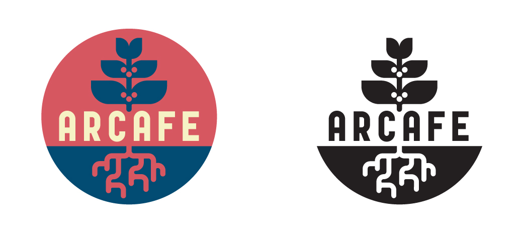
Arcafe
Via coffee enthusiast Geoff Watts, I was tasked with creating a logo for the Colombian coffee organization known as Arcafe. They requested an identifier that pointed to both their roots in coffee and Colombian culture as well as the “ark” referenced in their name. The colors were adapted from the Colombian flag.
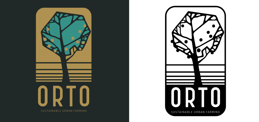
Orto Farms, Los Angeles
Inspired by early 20th Century Italian typography and architectural design, as well as the farm’s terraces and one of its main crops.
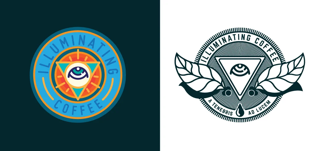
A Tenebris Ad Lucem
“Out of Darkness, Towards Light” or “From Unknowing, Into Illumination”. This latin phrase was based off of Intelligentsia’s one-time credo, “Illuminating Coffee” and was meant to highlight a desire to constantly learn and grow. I applied it to shirts, coasters, and marketing materials, and it eventually became the title of the short-lived magazine that was meant to showcase the company’s broader ideals and goals. The eye, coffee leaves, and cherries are meant to mirror the original wings and star logo. Since the eye is frequently jokingly compared to the “all seeing eye” of the Illuminati, I put it on a triangular filter to accentuate the reference and, In conjunction with the latin phrase, evoke secret societies. In symbology, an image reversed is meant to be the opposite of its original intent.
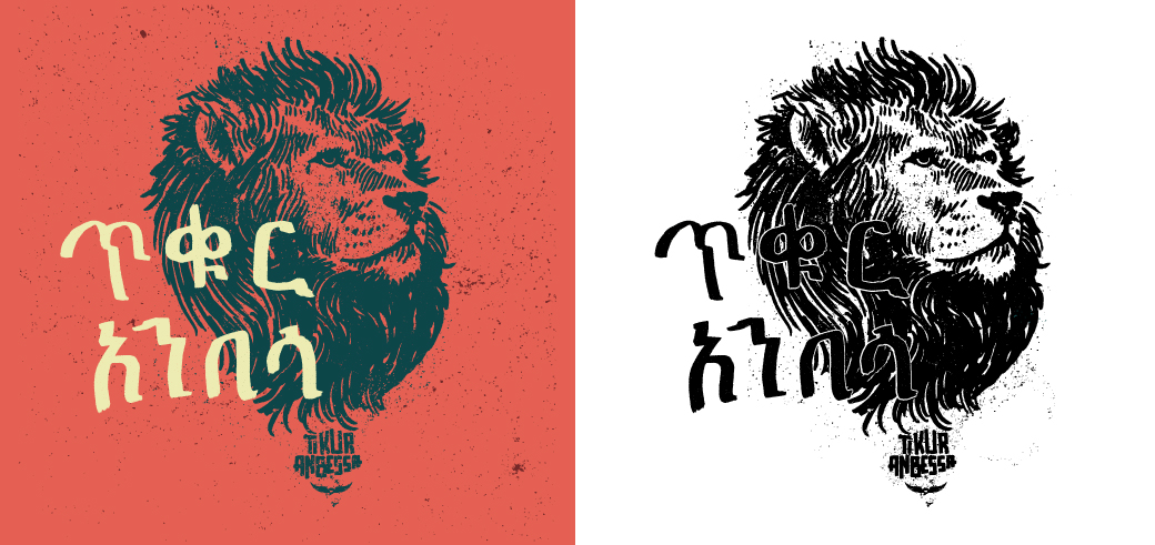
Tikur Anbessa, Ethiopia
Tikur Anbessa is named for a legendary, black lion protector-spirit in Ethiopia. This is the fourth and final incarnation of this mark.
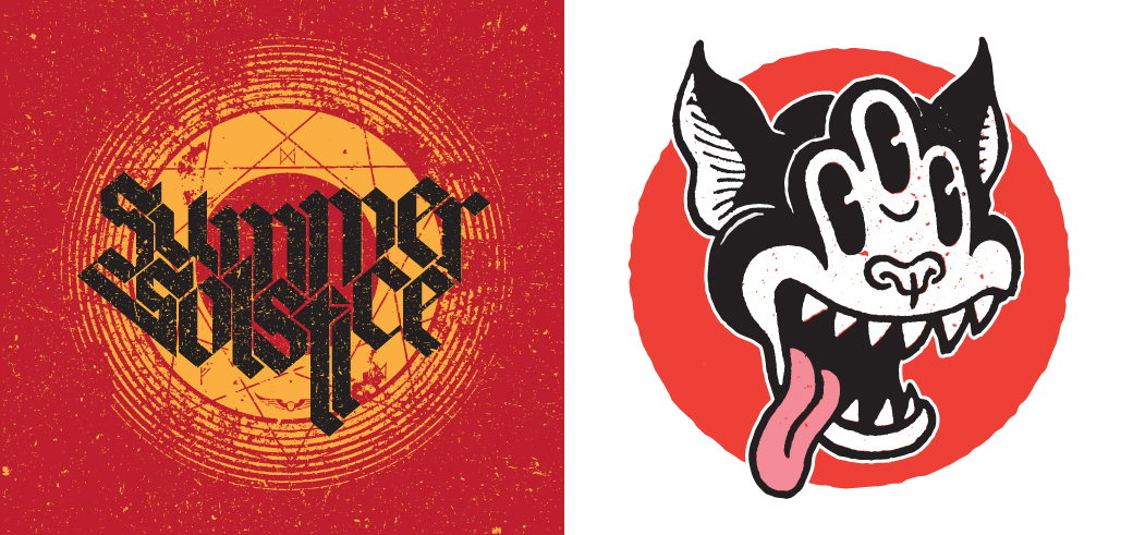
Summer Solstice & Illuminated Cat
Summer Solstice was designed for the seasonal summer blend of the same name. Inspired by old heavy metal album covers, I wanted to invoke a campy, 70s vibe. The Illuminated Cat was intended to be an enlightened update of the Black Cat logo. Clearly inspired by early black and white cartoons like Fritz the Cat and Steamboat Wille, as well as the work of contemporary luminary Jim Woodring.
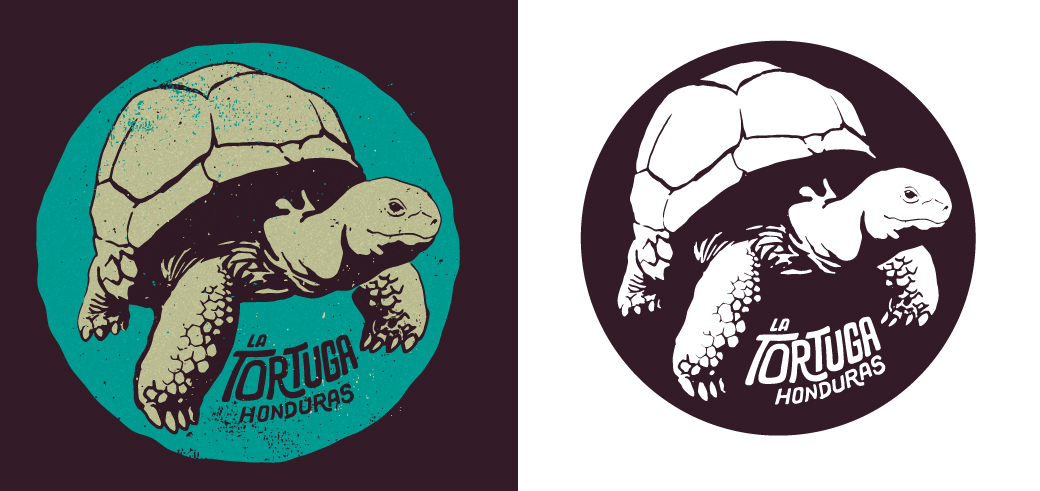
La Tortuga, Honduras
My version of the tortoise for the amazing coffees of Don Fabio Caballeros in Honduras.
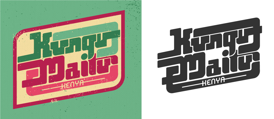
Kungu Maitu, Kenya
Intelligentsia’s main mark of their Kenya coffees. Kenya at its best means a bright, juicy coffee that’s almost punch-like, so my aim with this mark was to accentuate its sweetness by referencing vintage soda pop labels and 70s African pop-funk record artwork.
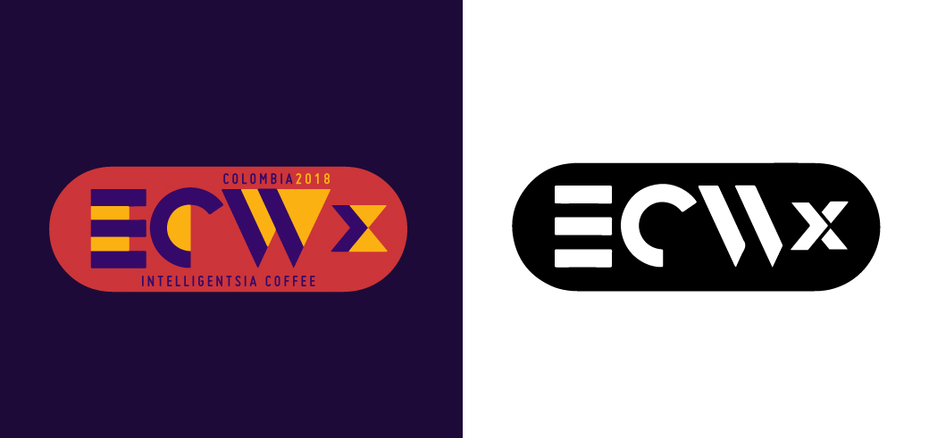
ECWx
In 2018, Intelligentsia started a new off-shoot of their annual Extraordinary Coffee Workshop series, aimed at producers and partners in a single country. For this logomark, I pointed the original logo I designed toward the future. Colors are meant to be interchanged according to country, if desired, with space for country specific text above and below the mark, within the capsule. Visit here to find out more. This typeface was inspired by the work of A. M. Cassandre.
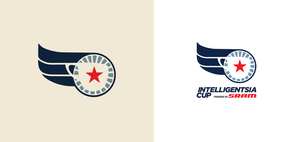
Intelligentsia Cup
I worked with Doug Zell to create this mark for the multi-state Bike Race, Intelligentsia Cup. I placed Intelligentsia’s iconic filter mug and star over a bicycle wheel and added a simplified version of the wings. It’s a reimagined version of the Wings & Star, logo geared towards cycling.
Check it out here if biking’s your bag.
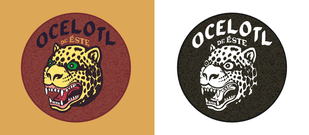
Ocelotl de Éste
This was the final proposed logo for a new group of coffees from the east of Nicaragua. The Ocelotl (“jaguar” in the English tongue) being not merely an animal, but a mythic figure from pre-Columbian Nicaragua, known to strike suddenly from out of nowhere. Here, the Ocelotl was chosen to represent a new generation of producers who burst onto the scene with amazing coffees.
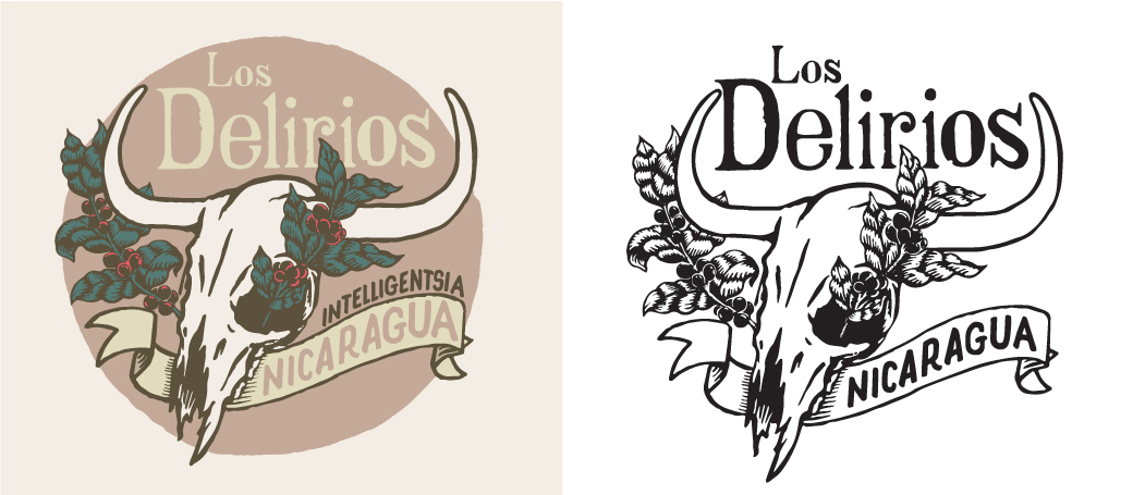
Los Delirios, Nicaragua
I designed this mark in conjunction with the Canales family of Finca Los Delirios and Intelligentsia’s Michael Sheridan. Los Delirios had been a cattle farm when the Donal Canales bought it, and there were many cow skulls littered across it. They hung many of the skulls from trees to remind them of where the farm came from and where we all return. I combined this haunting imagery with the new fruits of their labour.
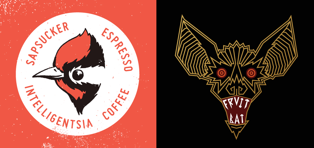
Sapsucker & Fruit Bat
Revamps for two of Intelligentsia’s seasonal Black Cat Project espresso blends. Soon to be seen on the NotNeutral lino mug in Intelligentsia coffee bars near you.
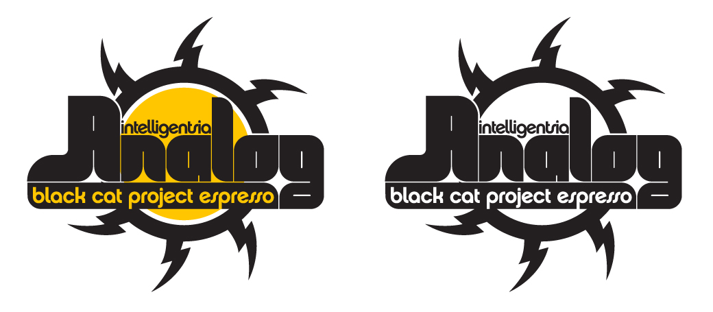
Analog Espresso
The original logo for Intelligentsia’s Black Cat Analog Espresso was an analog tube, a glass bulb used in guitar amplifiers and old televisions. The idea behind this blend is to present a traditional, Italian-style flavor profile, something typically eschewed by Intelli. With this mark, I focused on the iconography and typography of vintage packaging from the early days of tube amps to impart that old-school, “analog” feeling.
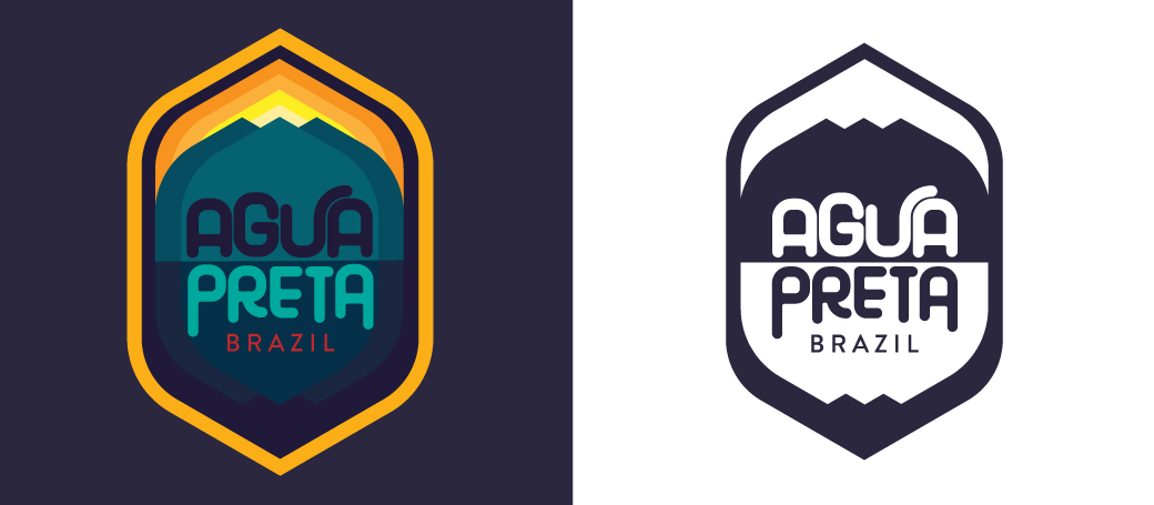
Agua Preta, Brazil
The origin of the name Agua Preta is steeped in Intelligentsia lore. As much as I would love to elaborate, all I can say is that the English translation is “black water”. Brings coffee to mind, no? Brazil is a beautiful land of vast rain forests, soaring mountains, and pristine lakes. It’s also by far the largest producer of coffee in the world and has incredibly advanced technology in all phases of production. For a mark of such intensity, I wanted to soften Brazil’s titanic image somewhat with the timeless influence of America’s Nation Parks logos.
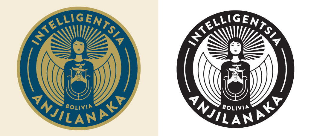
Anjilanaka, Bolivia
From the highest farm in the world descend award-winning coffees. This mark is a reverent reimagining of the original Anjilanaka illustration.
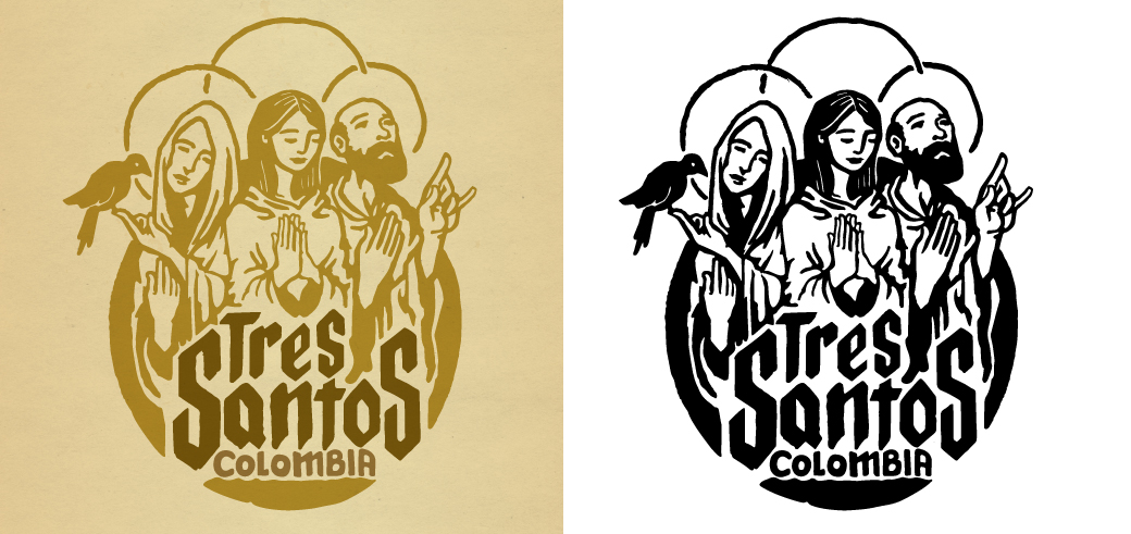
Tres Santos, Colombia
This is the third incarnation of the Tre Santos mark. The first referenced saints and the second referenced some specific farmers. For this iteration, I wanted to do a fun take on the idea.
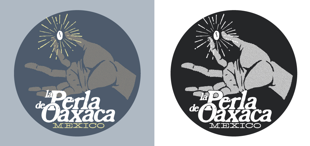
La Perla de Oaxaca, Mexico
La Perla was Intelli’s first Direct Trade coffee. In redesigning its mark, which was wonderful conceptually, all that was needed was a stylistic update to the original.
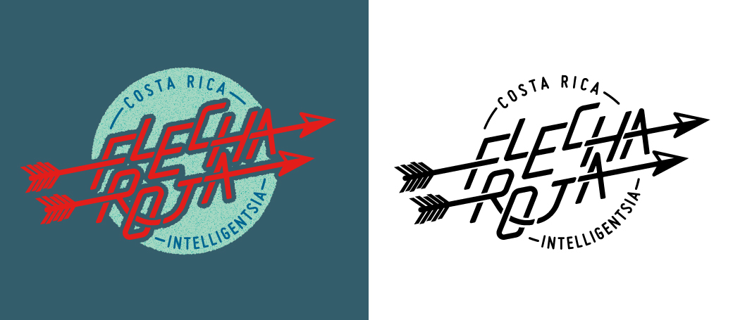
Flecha Roja, Costa Rica
The “Red Arrow” of Intelligentsia’s flagship Costa Rica coffee has been flying long and far.
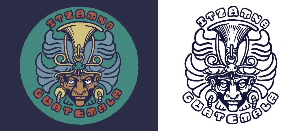
Itzamna, Guatemala
Itzamna was a Mayan god who was responsible for agriculture, among other things. He was represented as an old man, frequently cranky but happy to help his children in many different ways. For this mark, I looked to Pre-Columbian depictions of this venerated deity and Mayan hieroglyphs to create a modern interpretation of one of Intelligentsia’s oldest partnerships.
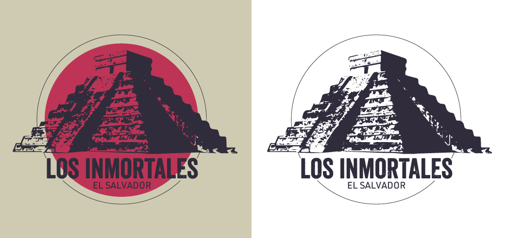
Los Inmortales
The original mark for this coffee was Hermes. Not only did it remind me too much of the FTD logo, it seemed a shame not to pay respect to the region’s history, particularly when there is a pyramid so close to the main farm, Malacara. To me, the ancient monuments of Mesoamerica stand as a testament to an enduring legacy. What better way to honor these “Inmortales”?
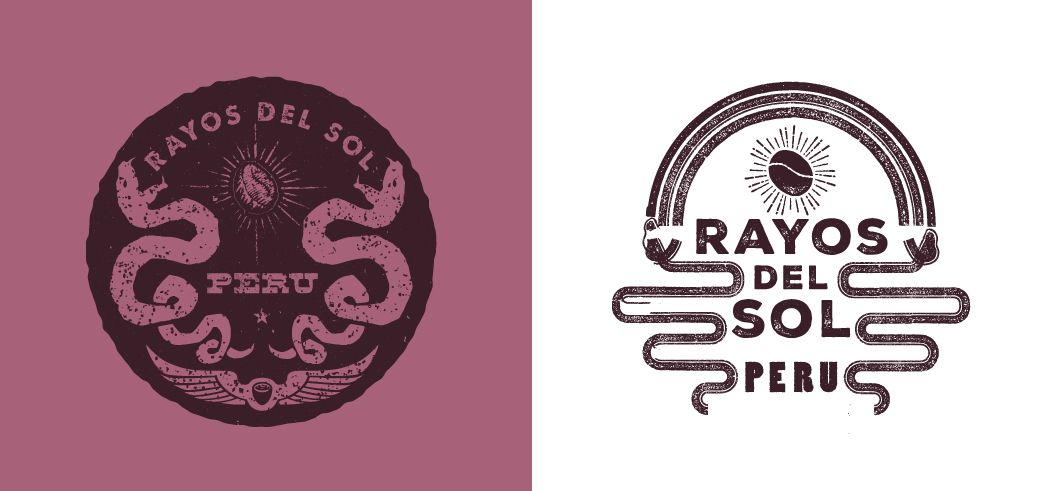
Rayos del Sol, Peru
Rayos del Sol is a farm Intelligentsia works with in Peru. This mark was based off of a crest that one of the farmers liked. The version on the right was a quick and dirty logo, the version on the left was the final version.
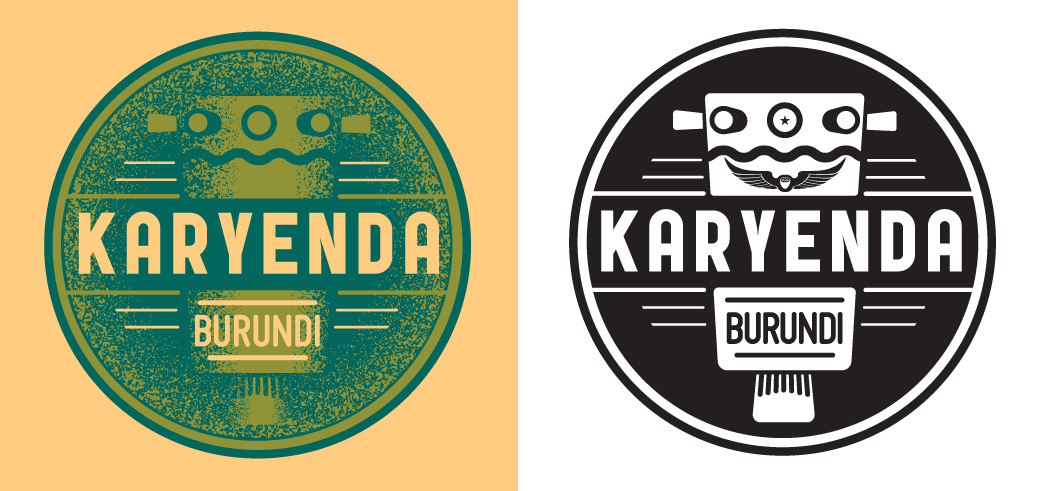
Karyenda, Burundi
The karyenda is a drum reserved for sacred rituals in Burundi. This mark pays homage to the coffee’s namesake.
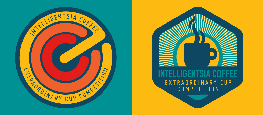
Extraordinary Coffee Competition
Two proposed marks for Intelligentsia’s Extraordinary Coffee Competition, a new competition held within the ECW conference.
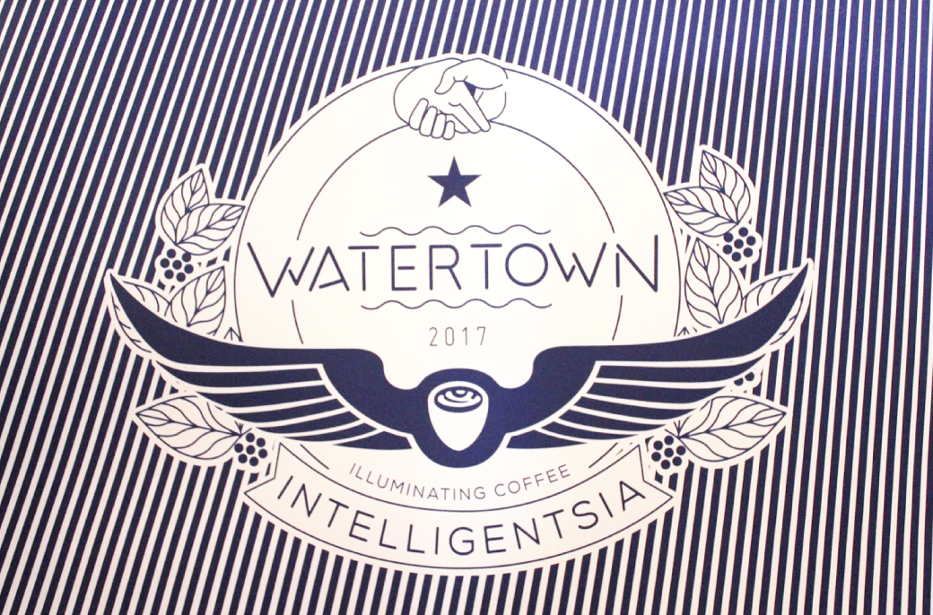
Watertown, MA
A seal designed for the Watertown coffee bar, here with the op-art lines. This specific graphic was used for the windows before opening, but the seal was applied across multiple platforms. It was initially inspired by Watertown’s city seal.
