•
graphic design • brand identity illustration • fine art
•
brand identity, graphic design, & illustration
Graphic, product, logo, & typeface design, layout, product photography
Outdoor signage designed for Intelligentsia’s presence at The Allis social space & café in Soho House Chicago.
As Erin makes her first political bid in her native Omaha for a Metro Board position, the Ratiofarm is proud to have helped envision a contemporary identity for print and web. This is the first signage for what will undoubtedly be a long political career for this progressive firebrand.
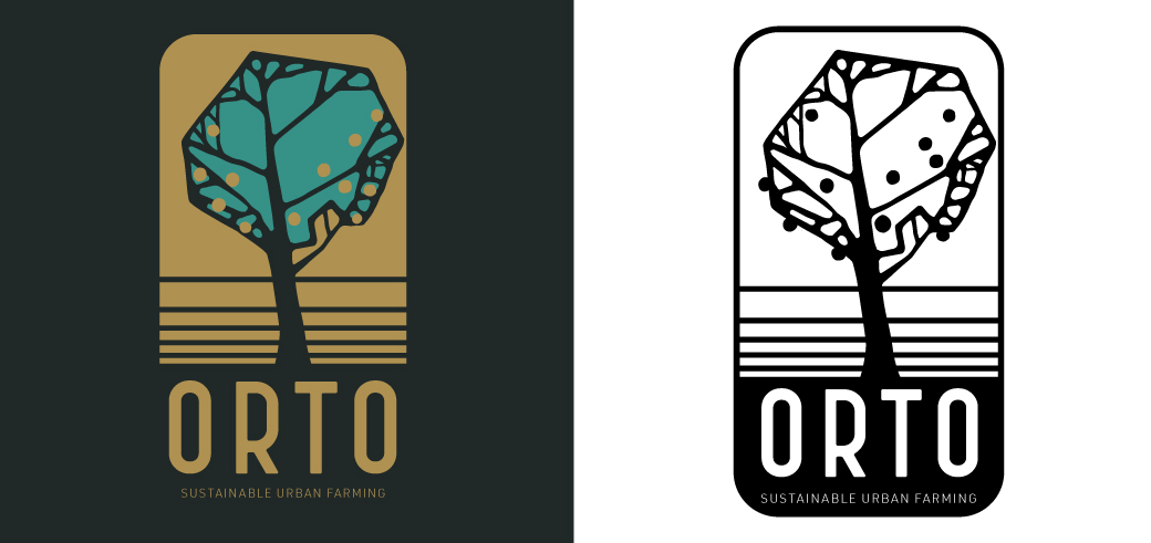
Located in Northeast Los Angeles, Orto Farms is focused on giving back to the LA community on multiple fronts. For their identity, we wanted to merge the essence of their farm with its Italian roots (“orto” is Italian for vegetable garden, and the founder is proud of his Italian ancestry). Together, we scoured designs and typography from early 20th Century Italy to craft a unique presence and hand-made font for this singular foundation.
I enjoy my work most when it benefits a noble pursuit, find out more about Orto’s inspiring mission here.
These are the first two issues of a magazine about Intelligentsia’s journey through the world of coffee that I concepted with Intelli’s Director of Sourcing and Shared Sustainability, Michael Sheridan. The first issue is a showcase for Intelligentsia’s 2017 coffee producer event, the Extraordinary Coffee Workshop. The second issue discusses their 2018 offerings from the Southern Hemisphere. All Design and Layout by the Ratiofarm, concept By the Ratiofarm & Michael Sheridan, photography by Taylor Moribito and the producers and buyers for Intelligentsia Coffee.
Because Kilogram Tea has many offerings that change with the season, their promotional one-sheets are in frequent need of updating. In late 2017, I moved away from an older style to embrace the aesthetics of the poster series I made for the brand (on view in the fine art section of this website), introducing organic shapes and patterns of a much wider variety than had previously been employed. Here you can see a sampling of a few of my favorites.
Photograph by Taylor Morobito.
One of many counter cards made for Intelligentsia’s retail coffeebars to advertise new and seasonal beverages.
A series of promo cards for retail customers, printed as both postcards and thick letter sized cards with stands for retail customers to display. A selection can be seen here.
Photos by A Klass.
Here’s just one of many ePostcards I made for email blasts to Intelligentsia's subscribers. This one features the seasonal blend Summer Solstice. Each year, I was tasked with making a new logomark for the seasonal blends, here you see Summer Solstice’s most recent iteration.
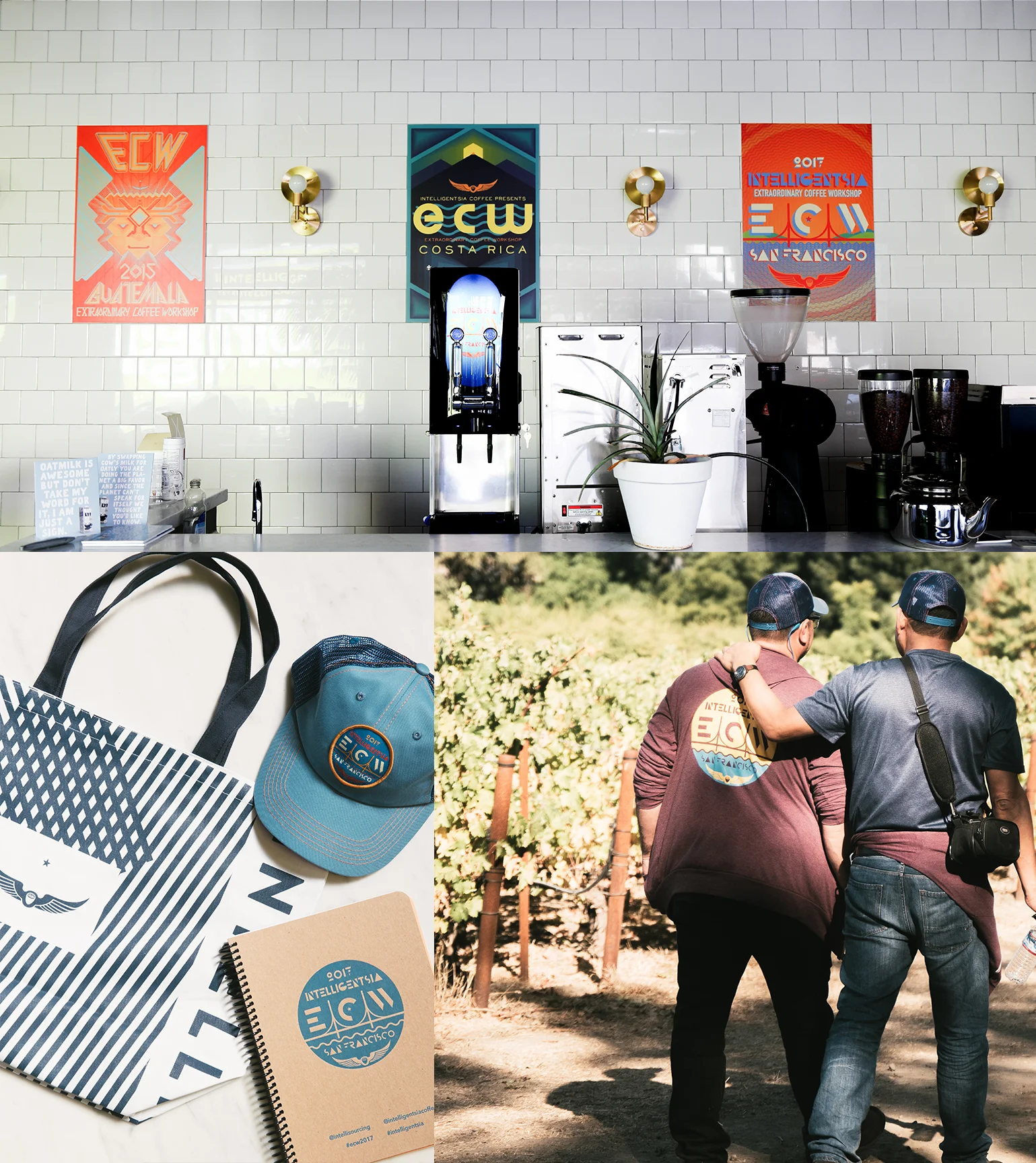
Hats, shirts, and notebooks made for the first ECWx conference. Click here to learn more.
Bring on those sweet summer afternoon garden parties! Lots of little details in this tribute to the classic Hawaiian button down and every coffee enthusiast’s favorite plant. Blue sunburst cup design also by the Ratiofarm.
Left photo by A Klass.
Right photo by Alina Tsvor.
The Intelligentsia logo tee for 2017-18. Illuminating the path towards an amazing coffee experience.
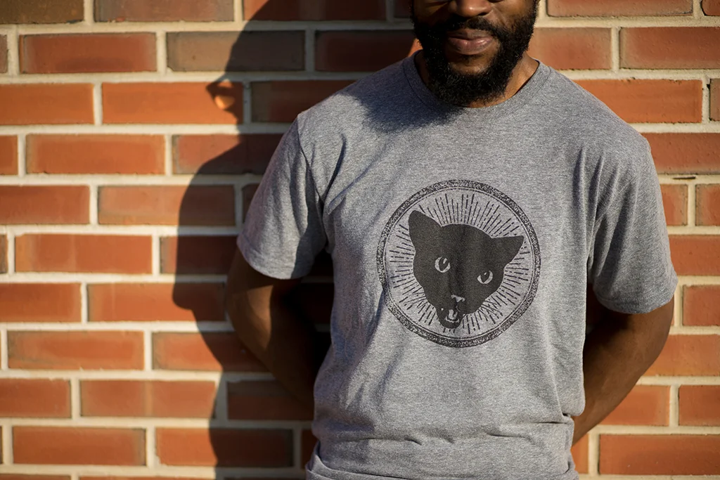
Insanely popular logo redux t for Intelli's signature Black Cat Espresso.
Photograph by A Klass.
Throwback shirt for Intelli's 10th year anniversary in LA. Loosely inspired by Ellie's shirt from The Last of Us.
Photograph by A Klass.
An eldritch visage emerged from the flames, saying, "Wouldst thou like to live deliciously?” “What must I do?” I answered. And it replied, “I will guide thy hand." So it was that the arcane El Diablo Dark Roast shirt was conjured into this realm.
Photograph by A Klass.
Inspired by ancient rights and early British Psyche-folk bands, this shirt celebrating Intelligentsia's Summer Solstice Blend was printed on a mineral washed tee for added pseudo-nostalgia.
Photograph by A Klass.
Blue and red double print on a baseball t, goes great with 3D glasses!
Photograph by A Klass.
Crewneck sweat for the initiated.
Photograph by A Klass.
Due to the response we received from the design on the previous year's flier, we decided to make the Intelli coffee sweater a reality. In the era of ugly sweaters, this was a smash hit that sold out in less than a week!
Photograph by A Klass.
Inspired by the classic paisley design.
"From darkness, towards illumination"
In this embroidered patch, the eye is drawn from the Intelligentsia wings logo, and plays once again with the inverted idea of the all-seeing pyramid: to lift up and look up.
Photos by Taylor Morabito
It gets hot in the tropical regions where coffee grows, so Intelligentsia's green coffee buyers stay cool and shaded with this well-ventilated piece of headgear. Works great in non-tropical climes as well!
Accompanying hat for the Holiday Sweater.
Swag for Intelligentsia's 2017 Extraordinary Coffee Workshop, including posters, hat, hoodie, and sketchbook (by the amazing Shawn Smith at reSketch)
Photos by Taylor Morabito
Transforming the op-art cup design into a tote bag & headgear.
Photograph by A Klass.
Ditch those earth-hating plastic bags and opt to haul your sundries in these Intelli tote bags! Designed for the Intelligentsia at the High Line Hotel and LA retail locations.
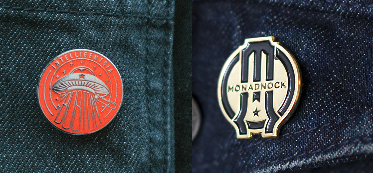
Original designs for Intelligentsia’s Post Office Square shop in Boston and Chicago’s Monadnock coffee bar.
Having started in the Boystown neighborhood of Chicago, Intelligentsia has deep roots in the LGBTQ community. These are designs for 2017 and 2016 Pride.
Photograph by A Klass.
People freakin' love enamel pins, and these two new designs went like hotcakes.
Photograph by A Klass.
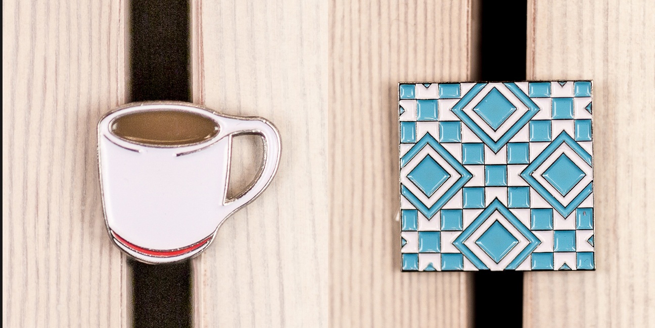
Intelligentsia's pioneering filter mug and iconic Silver Lake tile... as enamel pins!
Photograph by A Klass.
More specialized, short-run, letter press labels for Intelligentsia's super high-end coffee collection. Lovingly printed by the excellent team at Rohner Letterpress.
Two mind-blowing geshas from coffee's origin. Printed by the amazing folks at Rohner Letterpress.
Photograph by A Klass.
New themed sleeves to keep your hands safe while enjoying your favorite coffee.
Photograph by A Klass.
A new cup celebrating 20 years of coffee exploration (taken from my design for our coffee bar at Liberty Fairs NYC), a new seasonal clutch for the holidays.
Photograph by A Klass.
Enjoy your sparkling Turmeric Tonic on the go, or take a load off in a coffee house and sip that effervescent King Crimson at a leisurely pace. Both of these designs were inspired by the packaging for Kilogram’s loose-leaf teas.
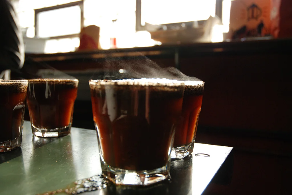
Photography by Taylor Moribito
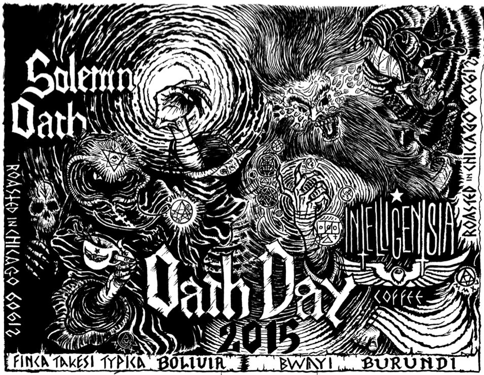
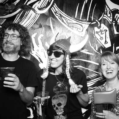
A limited edition mug for Solemn Oath’s sixth anniversary party, a.k.a. Oathday, this was a collaboration with Jourdon Gullett (in-house designer for Solemn Oath, can on the left). He made the lettering for the mug and I based the Intelligentsia lettering off of that. The fighting raven and snakes imagery was inspired by Jourdon’s poster art for the party, and based on a logo I made for featured Peruvian coffee, Rayos del Sol.
Check out Jourdon’s mind-melting work here.
Find out more about Solemn Oath Beer here. I don’t drink beer often, but when I do, you can bet your sweet ass it’s Solemn Oath.
This was a last-minute holiday project to test/introduce a new product to Intelligentsia’s shops. I was asked to make a “woodsy” graphic about camping or hiking. I grew up in the mountains of the western Carolinas, something I frequently find myself longing for. This phrase pops up in my mind when the city gets to be a little much, so it seemed only natural to apply it to this situation. The idea transferred well to this incredibly popular item.
Photo from the blog Indulge Inspire Imbibe.
A new, high-end line of coffees requires distinctive packaging. In order for the product to stand apart from its cousins on Intelligentsia's retail shelves while remaining cohesive with the established design language, a calm, matte-white bag was chosen. The ribbon was placed off-center to draw the eye, while a simple, elegant gold-leaf design was employed to evoke the quality of the product within.
Available here for aficionados and the curious.
Photograph by A Klass.
This is the first of several Reserve Collection packages that I designed.
The design for Heritage’s coffee bag drew inspiration from a large collection of old matchbook covers that owner Michael Salvatore inherited from a family member. It was hard to pick a single design, but in the end, we went with the one on the top far-right. Click the link to see the final product.
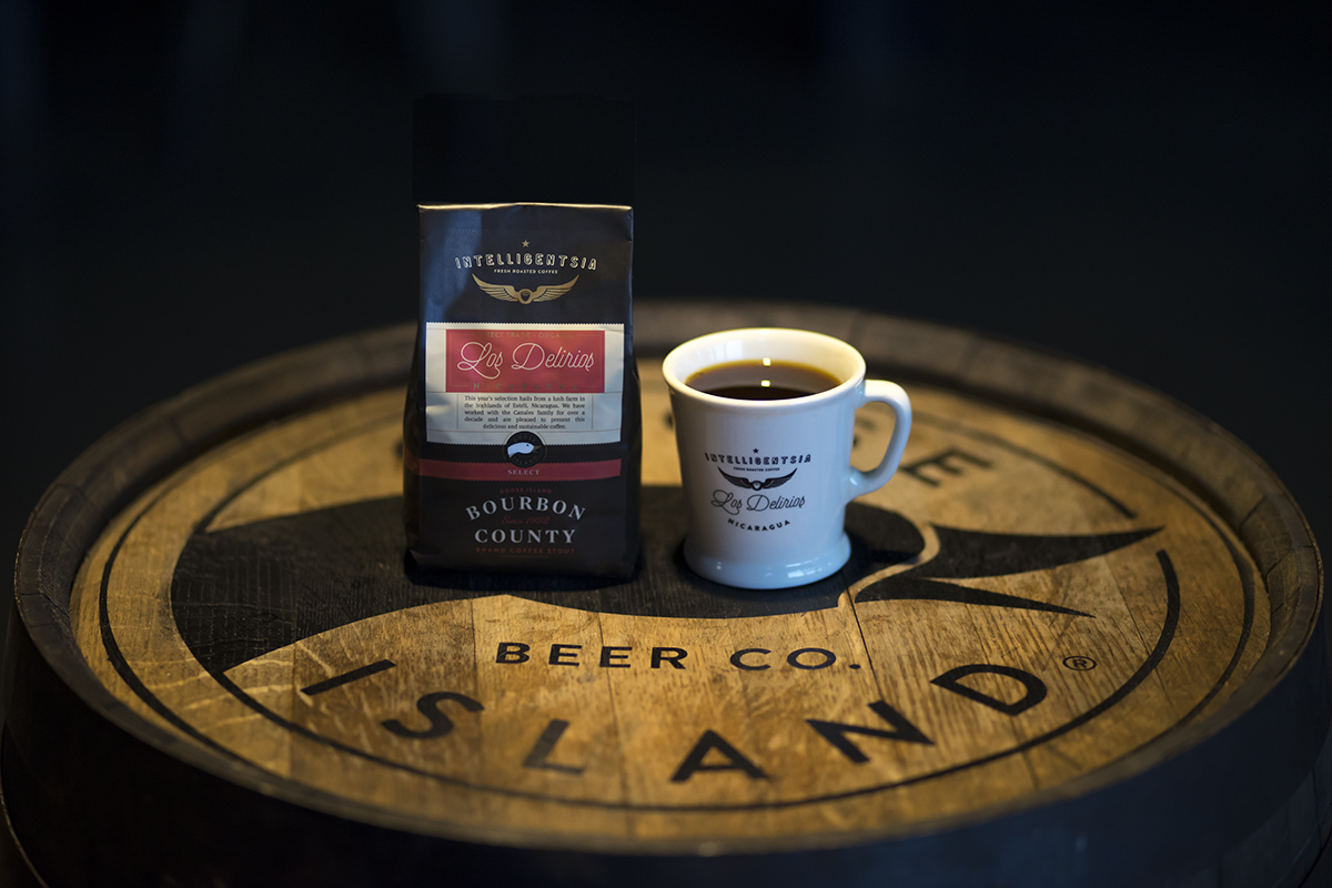
The coffee bag design for the non-alcoholic companion piece to Goose Island’s 2017 Bourbon County Coffee Stout.
The coffee component for this year's incarnation of Goose Island and Intelligentsia's coveted, Bourbon barrel-aged coffee stout is itself a perennial favorite. This year, we decided to dress up the GI's coffee selection (Los Delirios from Nicaragua) with a bag based on the new Bourbon County bottle. A mug came with a bag of the coffee as part of a special set. Upon its release on Black Friday, the set sold out in three hours.
Photograph by A Klass.
Packaging wrap for an Intelligentsia collaboration with Mayana Chocolates.
Photograph by A Klass.
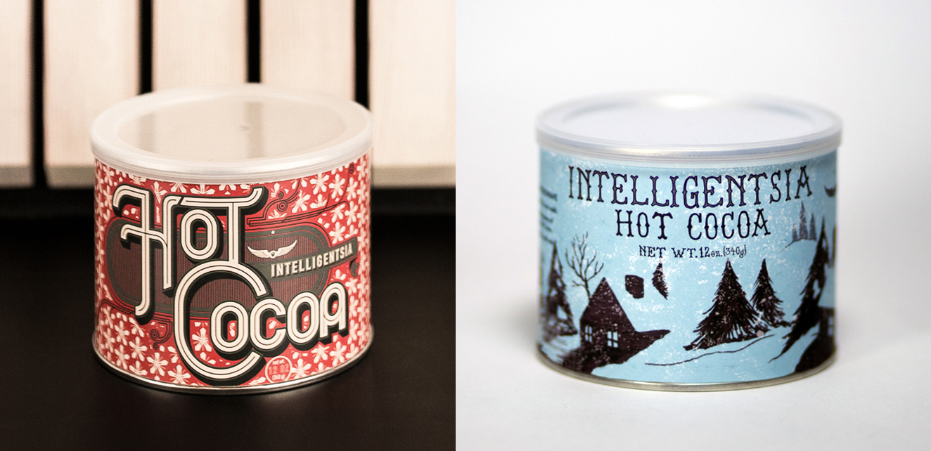
Just in time for the cold weather, Intelligentsia's holiday themed Cocoa tins arrived. Left is 2017, right is 2015.
A play on the new striped cup, to enjoy at your office party!
Photograph by A Klass.
Believe it or not, the water that Intelligentsia uses in its cafés is expertly calibrated to provide optimum flavor, and it's even specific to each city we have shops in. People ask our baristas so frequently about how we get our coffee to taste so great that we decided to sell the water in these lovely growlers.
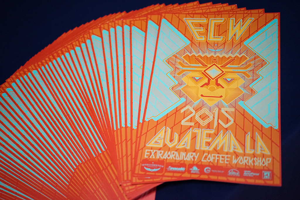
This poster features all of the main graphic elements I created for Intelligentsia's 2015 Extraordinary Coffee Workshop (ECW) in Guatemala. The face is an interpretation of the Yucatec Mayan god Itzamna, who has long been a symbol invoked by Intelligentsia and our Guatemalan partners. I've been fascinated with the Mayan pictographic language for a while, so I blended that into a contemporary psychedelic band poster and a custom typeface, all placed to subtly evoke the volcanic imagery of the country. This imagery was broken apart in various ways for formats ranging from patches, t-shirts, and name tags to massive banners and vehicle magnets.
Photograph by Andrew Klass.
Raul Perez of Finca La Soledad (center) is seen here wearing the sublimation print t-shirt I designed for Intelligentsia's ECW 2015 in Guatemala. I incorporated aspects of the Guatemalan flag and national soccer team jersey to tie it to the ECW host country.
Photograph by Andrew Klass.
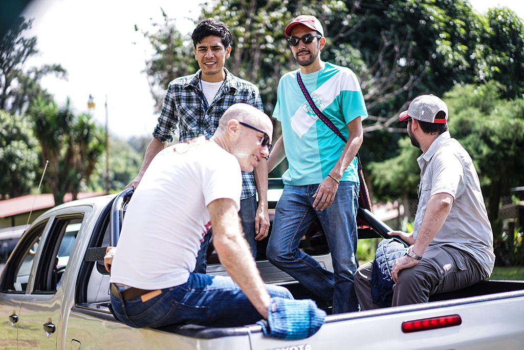
Here are two more examples of how I used the ECW imagery. Presented by the inestimable Geoff Watts.
Photograph by A Klass.
Here is a rendition by some of the local Guatemalan graphic designers I thought was pretty interesting.
Photograph by A Klass.
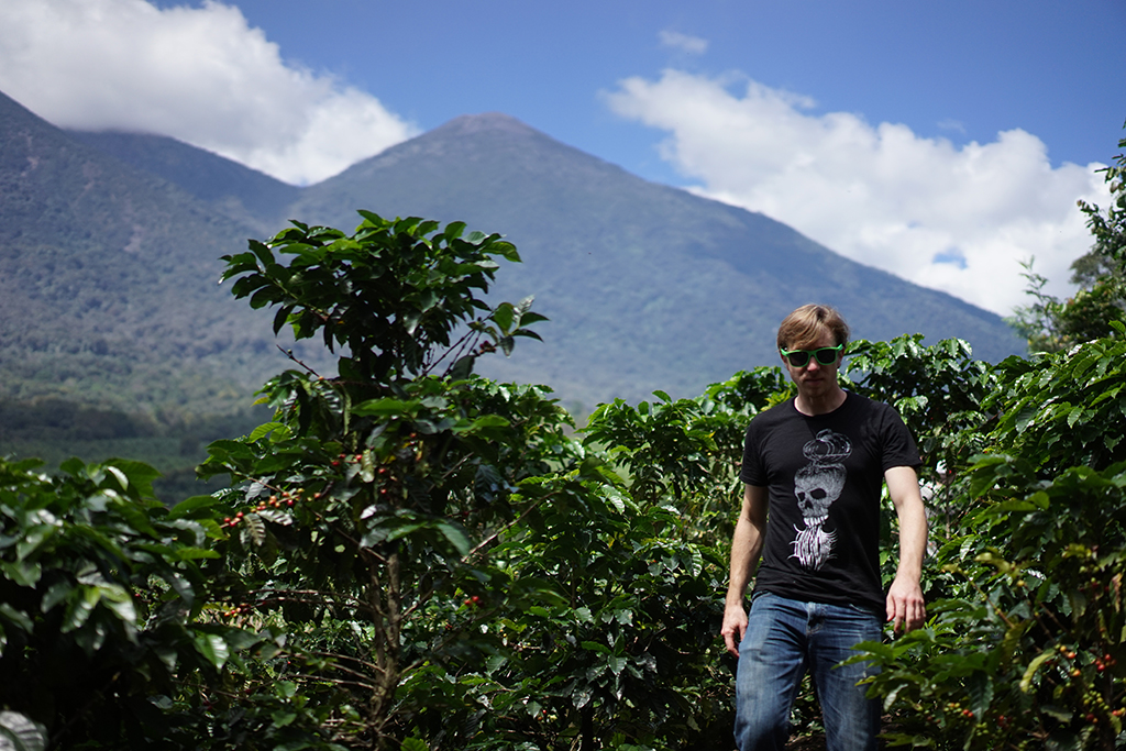
Intelligentsia's QC manager Chris Kornman was spotted in Guatemala rocking my sweet Black Coffee shirt.
Photograph by A Klass.
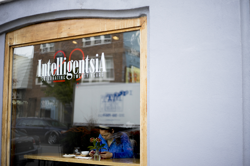
For Intelli's 20th year in business, I designed a logomark comprised of the original logo from 1995 and modern figure design. This has apeared in many forms since its original inception in early 2015, from shirts to glassware to neon. Here it is on the picture window of the Broadway flagship shop.
Photograph by A Klass.
A double-sided neon sign for Intelligentsia's 20th Anniversary at the flagship Broadway shop.
Photographs by Tony LeSeure
My first neon sign. The shop in Logan Square is a modern take on a 60s-style diner, so I incorporated that idea into this design.
Some proposed concepts for new neon signs.
The QC lab at Intelligentsia made a Black Cat espresso blend to celebrate the 20th Anniversary and needed a logo mark for promotion.
Photograph by Andrew Klass
This saw several different incarnations across web, social media, and print. This is the post card.
This graphic wrap I initially designed for our coffee bar at Liberty Fairs Fashion Show in NYC eventually morphed into Intelli's new 12oz cup.
Here is the wrap in more applications.
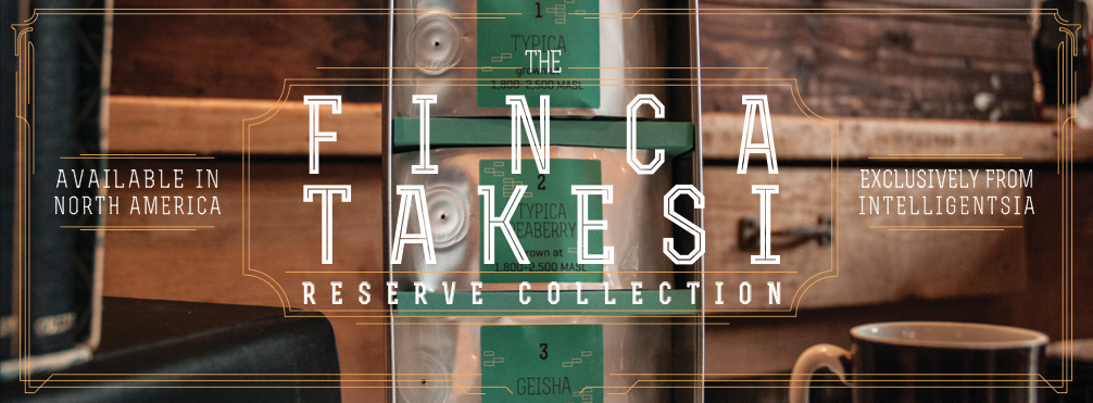
Web banner for Intelligentsia's Finca Takesi Reserve Collection. Photography also by Rob Patterson, 2015
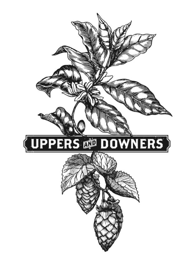
In February of 2015, Intelligentsia partnered with Good Beer Hunting for the first Uppers and Downers festival of coffee beers. Many of Chicago's local breweries and roasters came together at Thalia Hall to showcase a creative array of amazing flavors. A convivial and delicious time was had by all at this sold-out event. Check out Good Beer Hunting for more details on upcoming happenings, as well as loads of great stories and photography about beer.
Glasses and table.
Photography by Eva Deitch
Some paraphernalia from U&D, February 2015
Photography by Eva Deitch
I designed this floral motif based on the coffee tree. Sport it on this flat billed, five-panel hat with burnished leather Wings and star side patch!
For this design, I wanted to invoke a contemporary pattern trend. I took the simple star from Intelligentsia's logo and placed it in a polka dot pattern on a flat brim, five-panel hat. A burnished Intelligentsia wings and star adorn the front on a leather patch.
A first in the coffee world, this Intelligentsia Reserve collection featured three different parts of the coffee plant: coffee (obviously), the coffee flower (rare and expensive because it becomes the coffee bean), and sultana (also known as cascara), which is the fruit of the cherry that the bean grows inside of. I decided to step outside the box of our usual design to present something more pop oriented by illuminating the 3D aspect. The package included 3D glasses with which to view a poster, instructions, and packaging.
Photograph by Andrew Klass.
One of several poster designs based on ugly holiday sweaters, resulting in a sweater concept. Photograph from the Smithsonian archives.
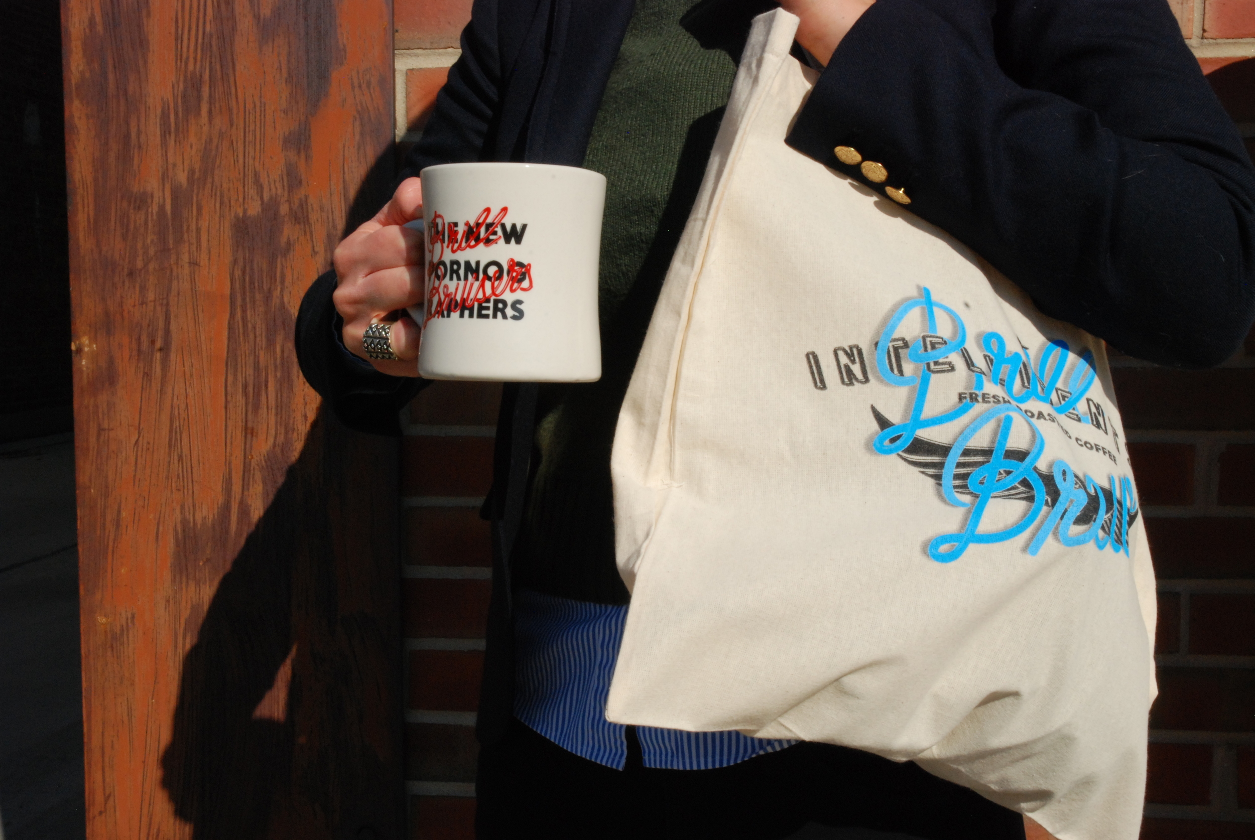
For this collaboration I made a companion graphic for the New Pornographers' Brill Bruisers album. The image on the bag was on the reverse side of the mug as well.
An "urban panel" ad at the Ashland/Division L stop. A companion bus panel was in circulation as well, both ran through Winter 2014 - Spring 2015.
A poster and font designed for a collaborative benefit with Sprudge coffee blog.
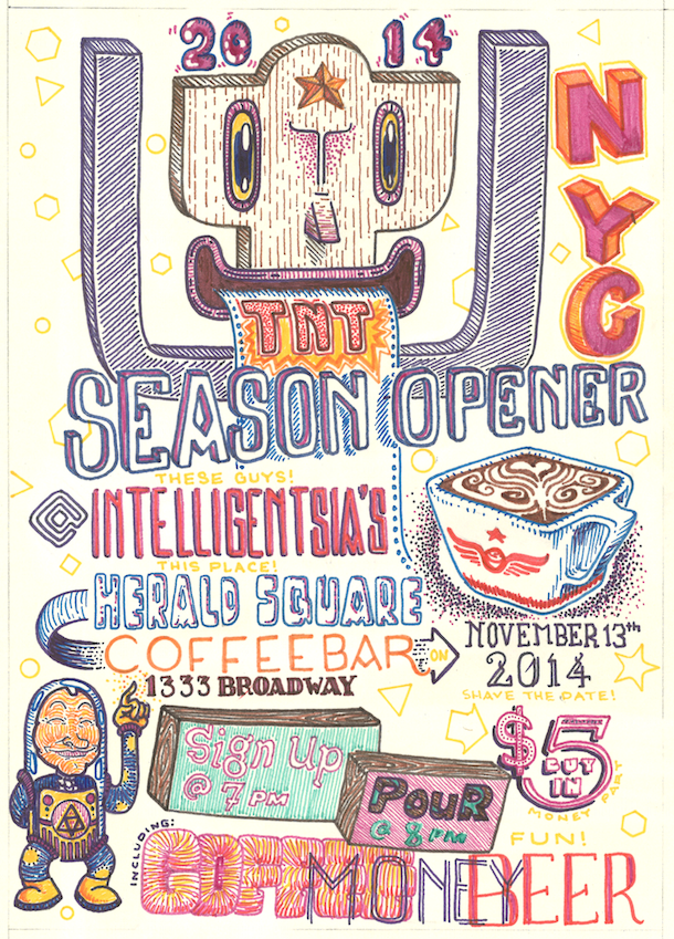
One of the great things about working for Intelligentsia is that I have so much creative freedom. Shop posters are an area where I get to play around and work through techniques and process inspiration.
Restaurant identity, logo and signage. Website and photography to come
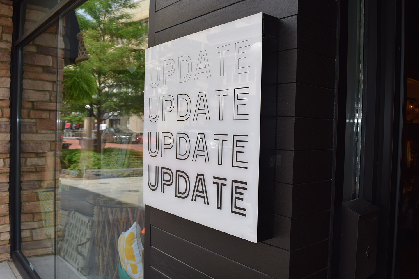
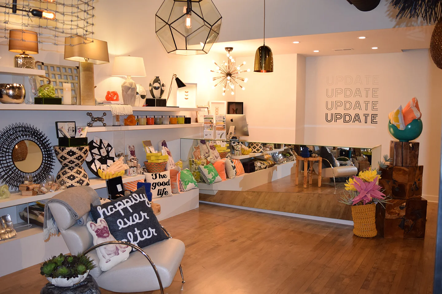
Update Interiors brand identity
Update Interiors brand identity
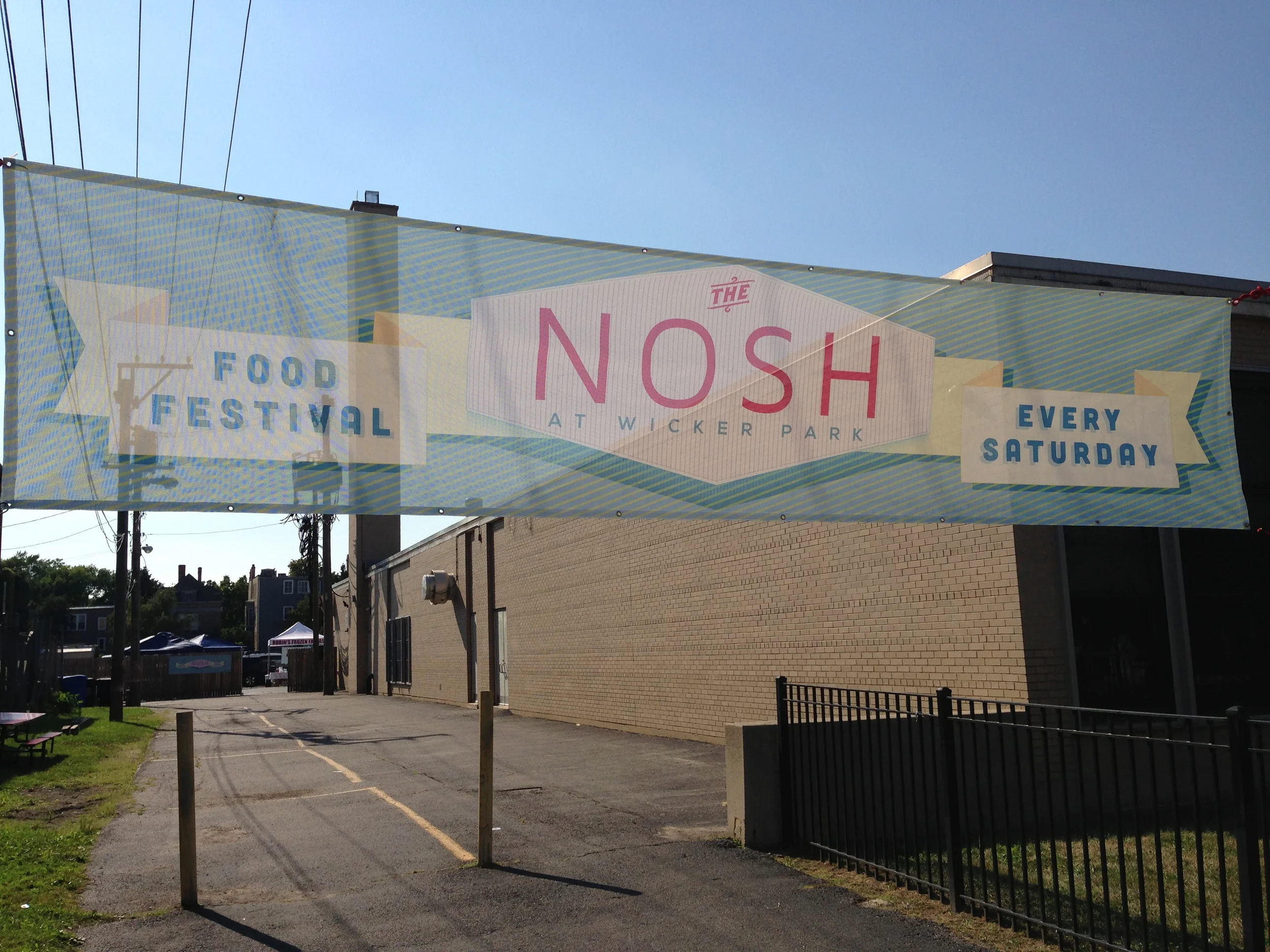
Logo and print design for The Nosh artisan food festival at Wicker Park, Chicago. Hit it this Saturday!
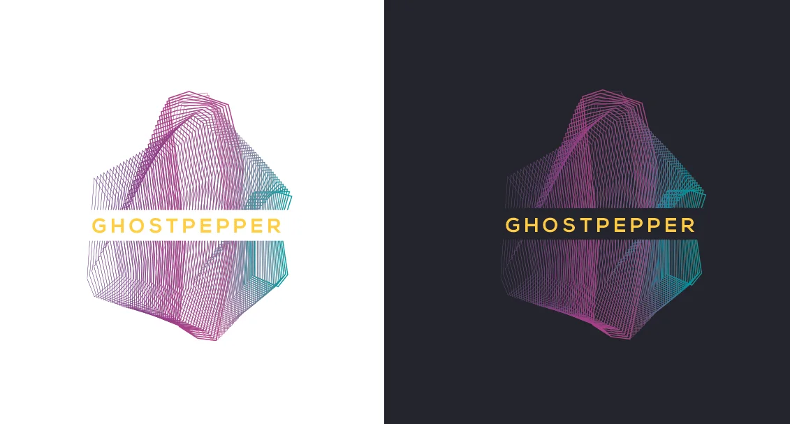
Ghostpepper Art Gallery and Performance Space logo, Chicago
Asian Studies Program logo for banners and t-shirts
History Department logo for banners and t-shirts
Personal poster for exhibition of paintings
Personal cover for music accompanying Liminalia book. Ongoing project
Personal exhibition poster for Focus Ten show
I based this logo on the Mayan glyph for "to scatter".
3D button logo for Northcenter Chamber of Commerce website
Poster design and digital tech for Dennis E. Wile's only exhibition of his World War II photography. At Emory University, Decatur, GA
One of several posters for Kilogram Tea and Intelligentsia’s coffee bars, this image features a matcha cortado.
Hold on tight and get ready for excitement at the annual “Chicago Summer Event”.
A rejected poster concept for Intelligentsia's 2017 Extraordinary Coffee Workshop in San Francisco.
Intelligentsia Coffee Halloween promotional retail poster. Ink and Ps, 2015
A poster for Unreal, an improv story telling showcase in Chicago.
Check it out here!
A couple of guys drinking coffee for an upcoming mug.
Pen + Ps, 2015
An Autumnal poster for Kilogram Tea, advertising the arrival of new pyramid teabags, including the incredibly popular Turmeric Tonic.
Prismacolor marker + Micron, 2015
This was a poster and postcard for Intelligentsia's retail shops, advertising Intelligentsia's presence at Sundance 2015, which was sponsored in part by Acura. Did you spot the Acura logo?
Prismacolor marker + Micron, 2015
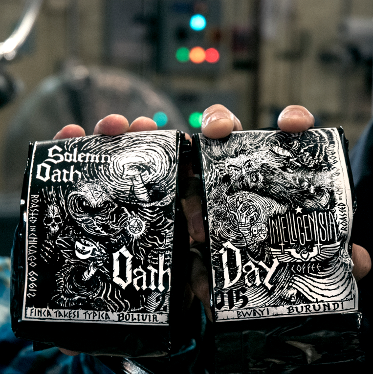
This artwork was split into two labels for the two coffees that were used by Solemn Oath Brewery this year. It's a wizard duel!
Micron, 2015
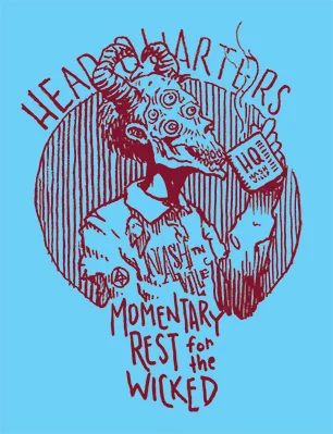
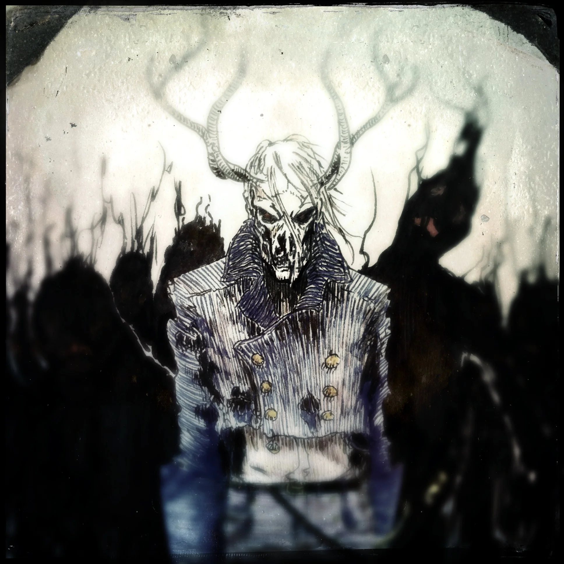
This illustration for a hoodie (inspired by alchemical and arcane symbology, and themes found in Black Metal) is a reimagining of Intelligentsia's logo. The "eye" of the latte art in the original logo is seen here as a third eye in a skull, representing the desire to understand our world and transcend the corporeality of our being. Our intellect is born upward from the clutches of the natural cycle of the universe by the roots and branches of the coffee tree. These very forces that, by their nature, limit us while simultaneously also givingus freedom are here representing the wings of the original logo. The eye in the magic star is the center-piece, representing the knowledge we seek to obtain, the heights we strive for, our dreams. It is not the all-seeing-eye we see on US currency or in the alleged symbology of the Illuminati, a scornful demigod, looking down upon the ignorant, hoarding it's secrets, and floating unattainably above. Instead, it is the projection of our ultimate realizations, the only possible direction of our journey, and the spark that C. rubiaceae gives us through ingestion.
White pen on black paper, 2015
The Intelligentsia team works incredibly hard to showcase the sweet flavors and aromas of the coffees they roast. As such, drinking their coffee black is the best way to experience these qualities. It's pretty much a religion.
White pen on black paper, 2015
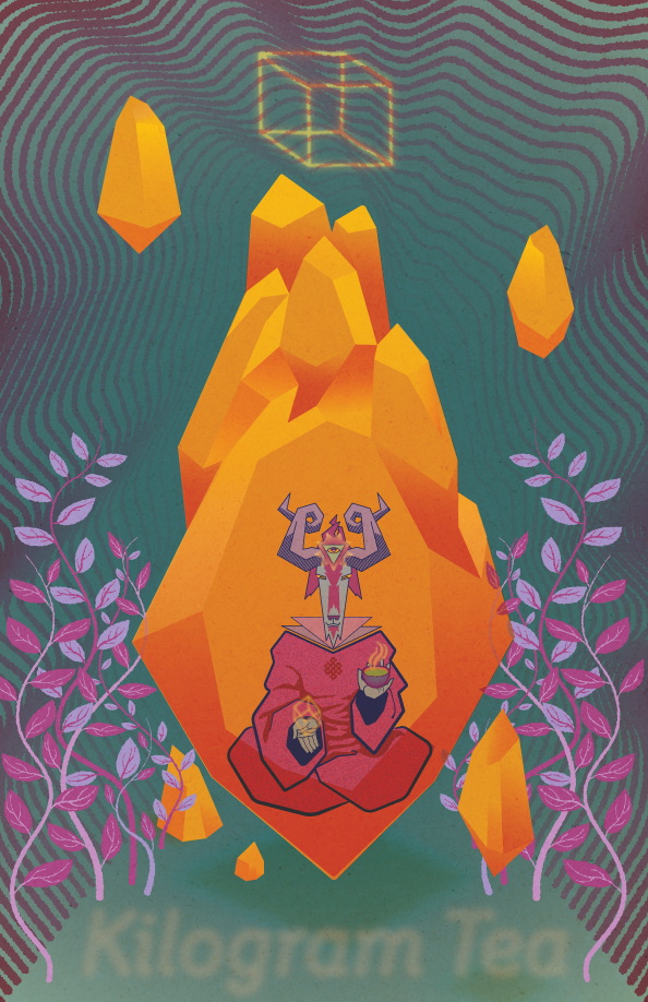
It only makes sense that the Tibetan God of Time Beyond Death would enjoy the invigorating and revitalizing Turmeric Tonic from Kilogram Tea. Seriously, this stuff is amazing, and if you're ever in Chicago, make it a point to stop by the Intelligentsia in Wicker Park where you can try it as sparkling iced tea. It's trans-dimensional.
3 color screen print for Kilogram Tea.
Celebrating darker holiday themes with Intelligentsia Coffee, 2014
This was a sketch I made in a state of delirium while fighting off sleep at my desk. Shortly thereafter, it was used for web ads, a store mini-poster and a beer cup at an event.
Ink illustration of C. arabica and hops for Good Beer Hunting's Uppers & Downers series of coffee and beer events, 2015.
A poster for the 2015 Intelligentsia Cup hanging in Intelligentsia Logan Square.
Prismacolor marker, 2015
Editorial image for Intelligentsia Coffee, 2014
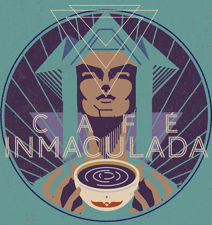
Based on a FLW sculpture, this was a promotional illustration for the Café Inmaculada Reserve Collection from Colombia.
Ps + AI, 2014
Prismacolor marker + Micron, 2014
Ai, 2015
2013, illustrator
For the forthcoming Nine Tenants of Magic children's book. A collaboration with author Gabriel Feijoo.
For the forthcoming Nine Tenants of Magic children's book. A collaboration with author Gabriel Feijoo.
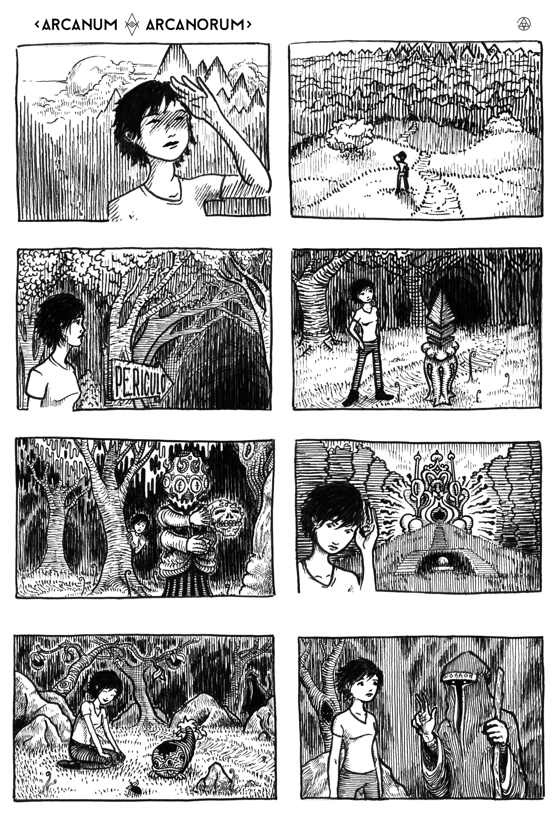
From the forthcoming book Liminalia: Somnium © Rob Patterson 2013, illustrator
From the forthcoming book Liminalia: Somnium © Rob Patterson 2013, illustrator
From the forthcoming book Liminalia © Rob Patterson 2013, ink
From the forthcoming book Liminalia © Rob Patterson 2013, gouache
From the forthcoming book Liminalia© Rob Patterson 2013, ink
from Liminalia © Rob Patterson 2013 (pencil)
From the forthcoming book Liminalia © Rob Patterson 2013, pencil
from Liminalia © Rob Patterson 2013 (ink)
For Wide Awake 2011 (ink, photoshop)
2013, ink
20o3, pencil
2009, ink
Billboard for Sol Café, Rogers Park, Chicago 2013
Best of the South, Cartoonist issue, 2012 (ink)
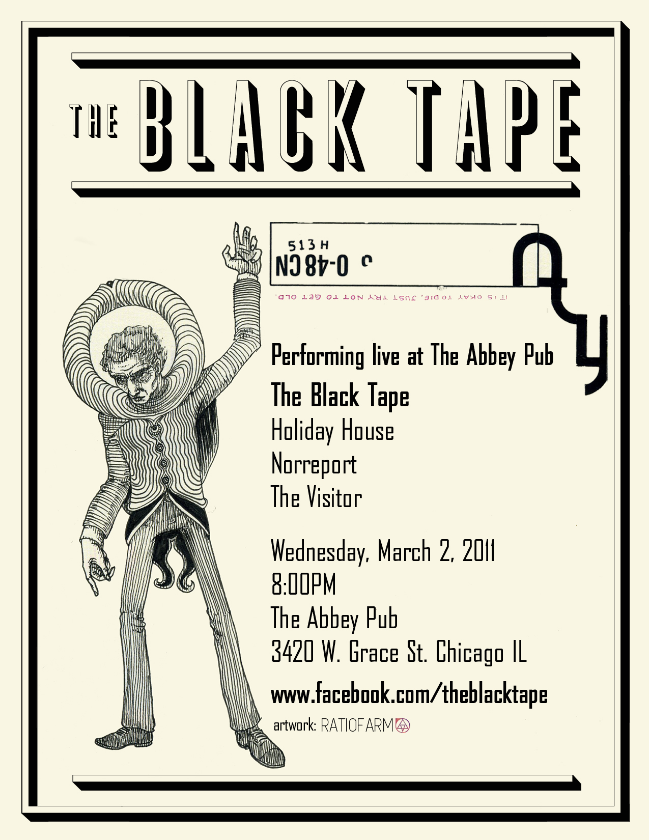
Poster for The Black Tape 2011
Poster for The Black Tape 2011
Poster for The Black Tape 2011
Poster for The Black Tape 2011
Poster for The Black Tape 2011
2004 (Ink)
For Time Out Chicago April 3-9, 2008 (Ink)
(gouache on wood paper)
2009 (gouache)
Cover for a small book of illustrations by Rob Patterson, 2003 (gouache)
From a series of 12 illustrations for A Guitar For Janie book with Pedro the Lion 7" ChapelleTNI / Suicide Squeeze Records 2000
Aspirin and water for TripleSpoke Brand Architects, ink & pencil
2012 (illustrator)
2012 (Illustrator)
For Wide Awake 2002, illustrator
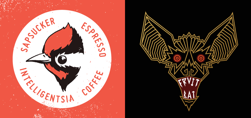
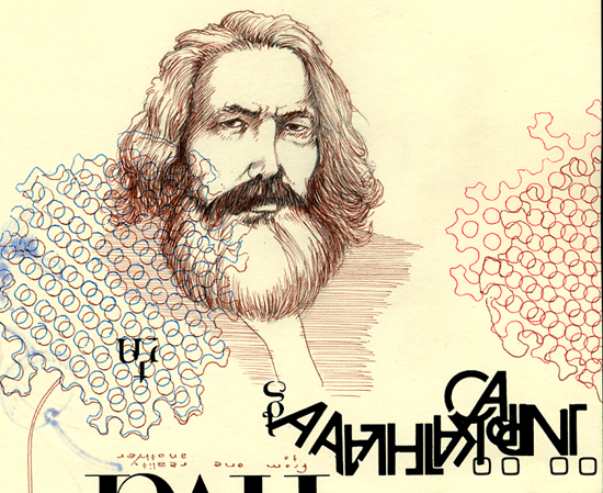
logo marks from here and abroad
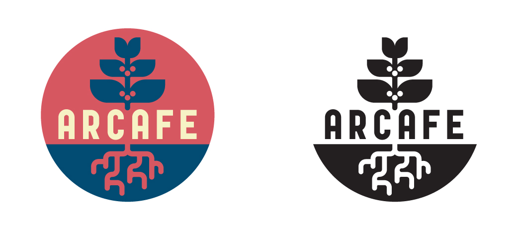
Via coffee enthusiast Geoff Watts, I was tasked with creating a logo for the Colombian coffee organization known as Arcafe. They requested an identifier that pointed to both their roots in coffee and Colombian culture as well as the “ark” referenced in their name. The colors were adapted from the Colombian flag.
Inspired by early 20th Century Italian typography and architectural design, as well as the farm’s terraces and one of its main crops.
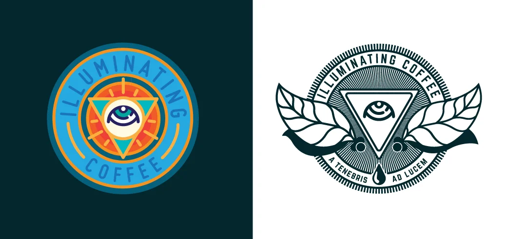
“Out of Darkness, Towards Light” or “From Unknowing, Into Illumination”. This latin phrase was based off of Intelligentsia’s one-time credo, “Illuminating Coffee” and was meant to highlight a desire to constantly learn and grow. I applied it to shirts, coasters, and marketing materials, and it eventually became the title of the short-lived magazine that was meant to showcase the company’s broader ideals and goals. The eye, coffee leaves, and cherries are meant to mirror the original wings and star logo. Since the eye is frequently jokingly compared to the “all seeing eye” of the Illuminati, I put it on a triangular filter to accentuate the reference and, In conjunction with the latin phrase, evoke secret societies. In symbology, an image reversed is meant to be the opposite of its original intent.
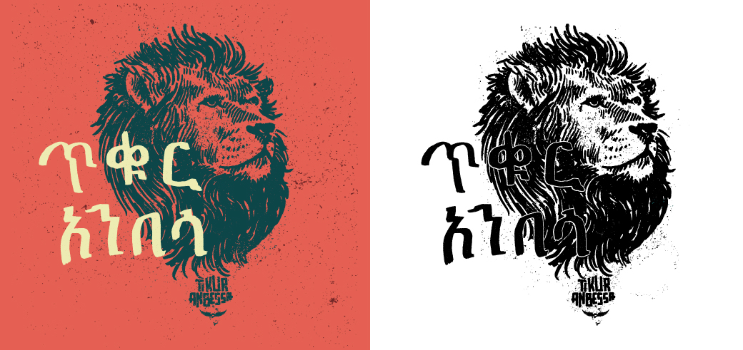
Tikur Anbessa is named for a legendary, black lion protector-spirit in Ethiopia. This is the fourth and final incarnation of this mark.
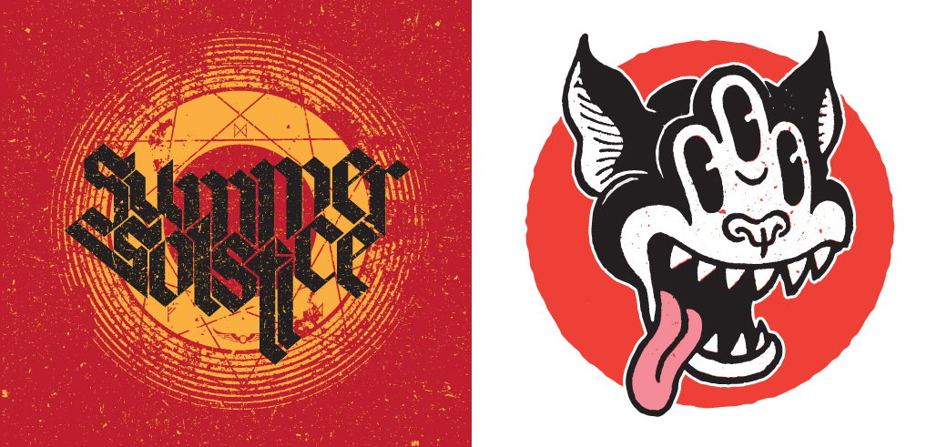
Summer Solstice was designed for the seasonal summer blend of the same name. Inspired by old heavy metal album covers, I wanted to invoke a campy, 70s vibe. The Illuminated Cat was intended to be an enlightened update of the Black Cat logo. Clearly inspired by early black and white cartoons like Fritz the Cat and Steamboat Wille, as well as the work of contemporary luminary Jim Woodring.
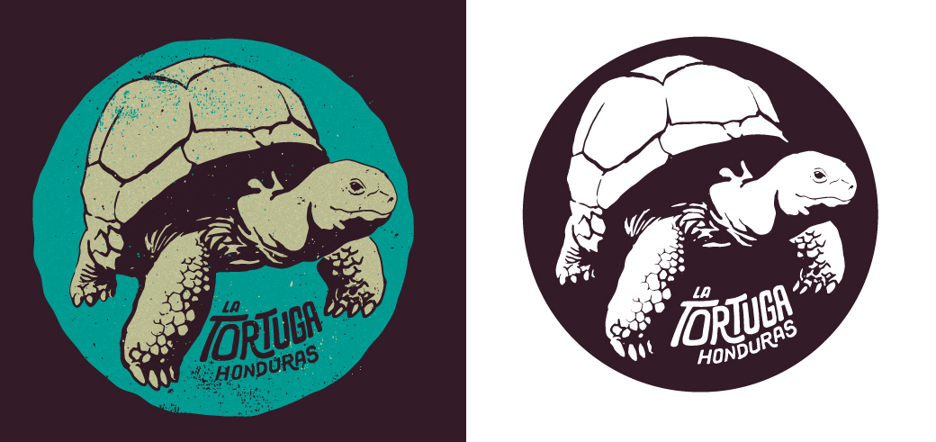
My version of the tortoise for the amazing coffees of Don Fabio Caballeros in Honduras.
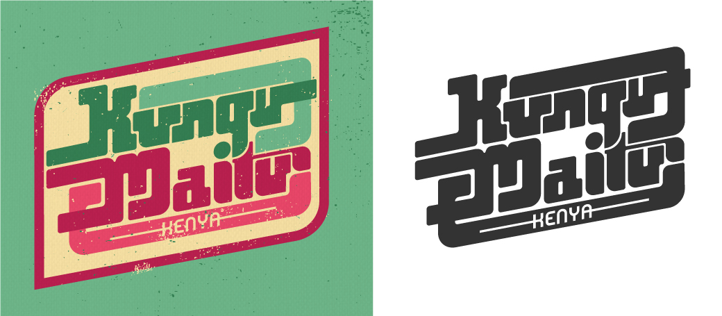
Intelligentsia’s main mark of their Kenya coffees. Kenya at its best means a bright, juicy coffee that’s almost punch-like, so my aim with this mark was to accentuate its sweetness by referencing vintage soda pop labels and 70s African pop-funk record artwork.
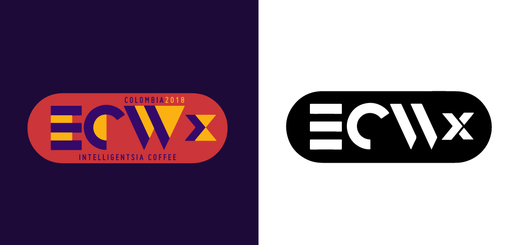
In 2018, Intelligentsia started a new off-shoot of their annual Extraordinary Coffee Workshop series, aimed at producers and partners in a single country. For this logomark, I pointed the original logo I designed toward the future. Colors are meant to be interchanged according to country, if desired, with space for country specific text above and below the mark, within the capsule. Visit here to find out more. This typeface was inspired by the work of A. M. Cassandre.
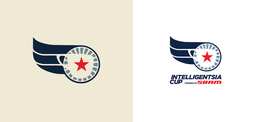
I worked with Doug Zell to create this mark for the multi-state Bike Race, Intelligentsia Cup. I placed Intelligentsia’s iconic filter mug and star over a bicycle wheel and added a simplified version of the wings. It’s a reimagined version of the Wings & Star, logo geared towards cycling.
Check it out here if biking’s your bag.
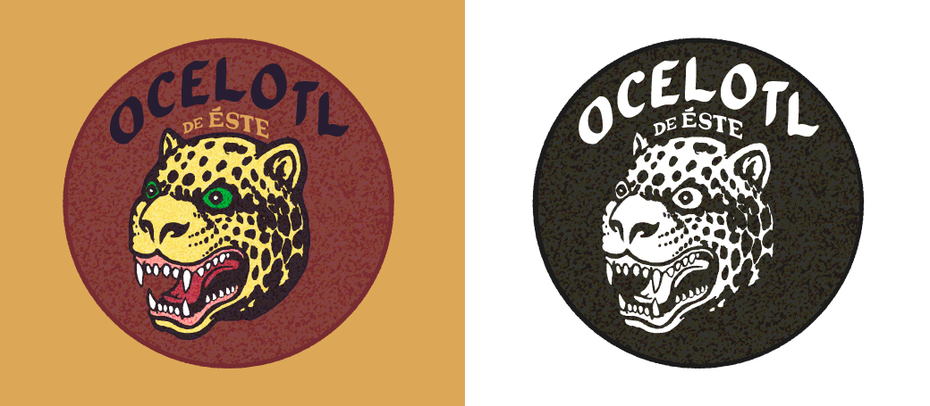
This was the final proposed logo for a new group of coffees from the east of Nicaragua. The Ocelotl (“jaguar” in the English tongue) being not merely an animal, but a mythic figure from pre-Columbian Nicaragua, known to strike suddenly from out of nowhere. Here, the Ocelotl was chosen to represent a new generation of producers who burst onto the scene with amazing coffees.
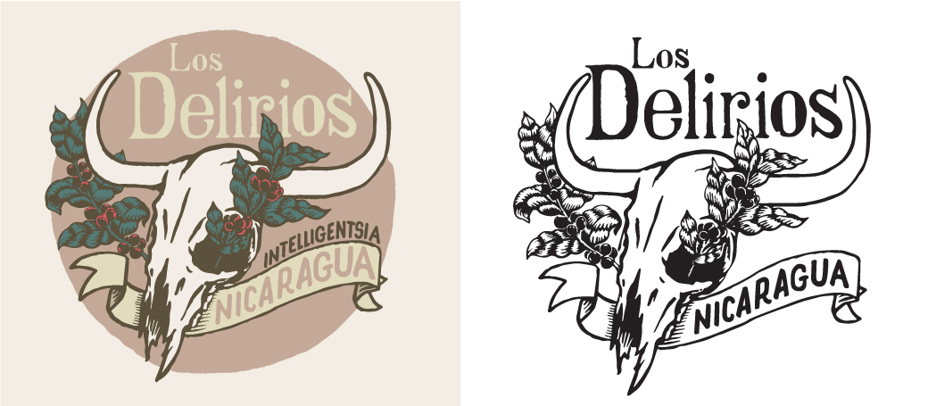
I designed this mark in conjunction with the Canales family of Finca Los Delirios and Intelligentsia’s Michael Sheridan. Los Delirios had been a cattle farm when the Donal Canales bought it, and there were many cow skulls littered across it. They hung many of the skulls from trees to remind them of where the farm came from and where we all return. I combined this haunting imagery with the new fruits of their labour.
Revamps for two of Intelligentsia’s seasonal Black Cat Project espresso blends. Soon to be seen on the NotNeutral lino mug in Intelligentsia coffee bars near you.
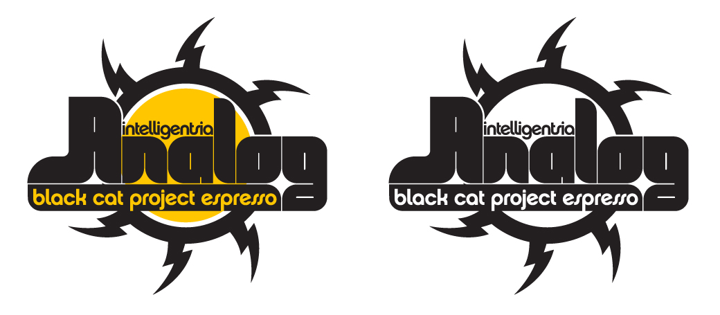
The original logo for Intelligentsia’s Black Cat Analog Espresso was an analog tube, a glass bulb used in guitar amplifiers and old televisions. The idea behind this blend is to present a traditional, Italian-style flavor profile, something typically eschewed by Intelli. With this mark, I focused on the iconography and typography of vintage packaging from the early days of tube amps to impart that old-school, “analog” feeling.
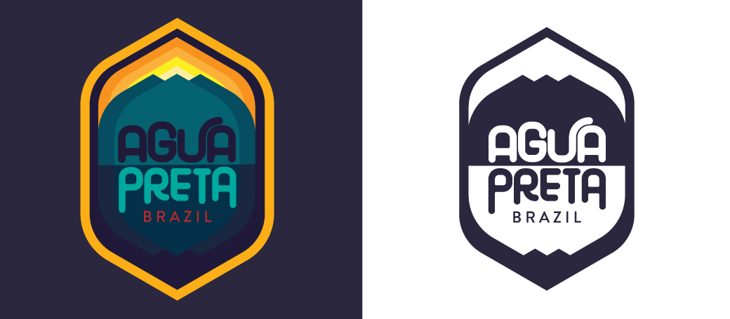
The origin of the name Agua Preta is steeped in Intelligentsia lore. As much as I would love to elaborate, all I can say is that the English translation is “black water”. Brings coffee to mind, no? Brazil is a beautiful land of vast rain forests, soaring mountains, and pristine lakes. It’s also by far the largest producer of coffee in the world and has incredibly advanced technology in all phases of production. For a mark of such intensity, I wanted to soften Brazil’s titanic image somewhat with the timeless influence of America’s Nation Parks logos.
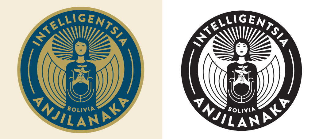
From the highest farm in the world descend award-winning coffees. This mark is a reverent reimagining of the original Anjilanaka illustration.
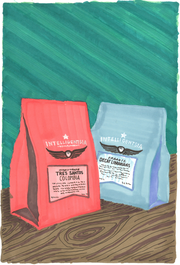
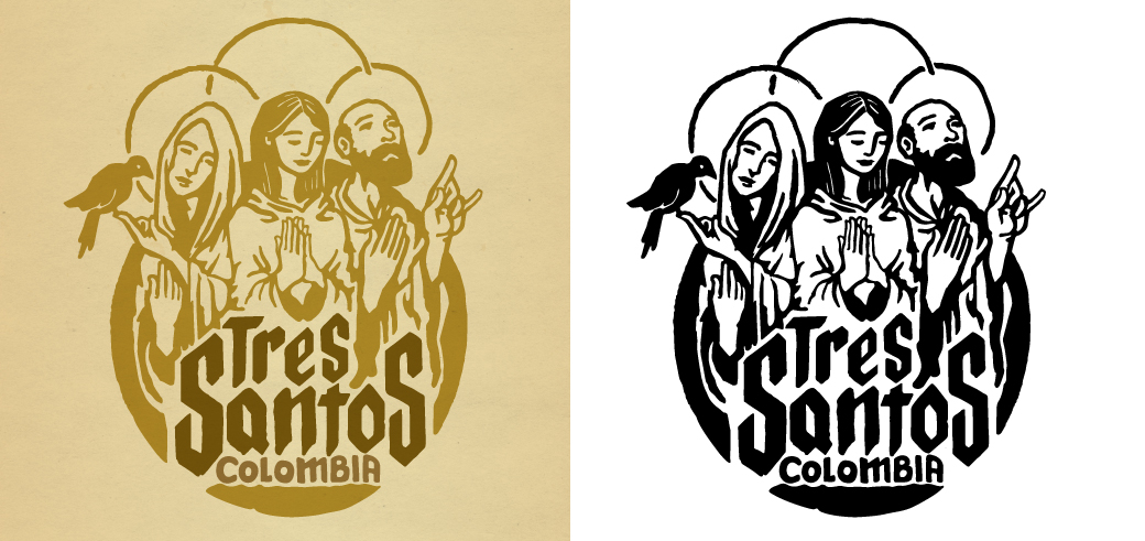
This is the third incarnation of the Tre Santos mark. The first referenced saints and the second referenced some specific farmers. For this iteration, I wanted to do a fun take on the idea.
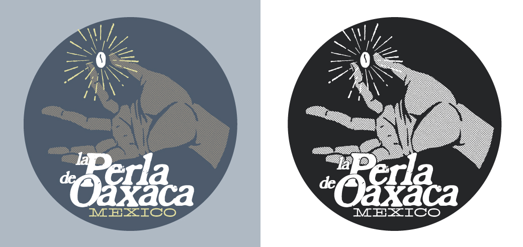
La Perla was Intelli’s first Direct Trade coffee. In redesigning its mark, which was wonderful conceptually, all that was needed was a stylistic update to the original.
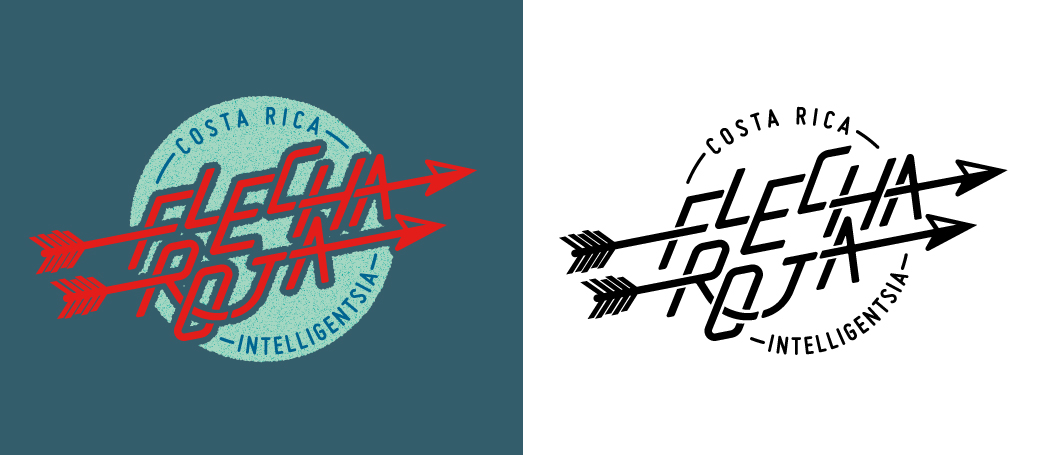
The “Red Arrow” of Intelligentsia’s flagship Costa Rica coffee has been flying long and far.
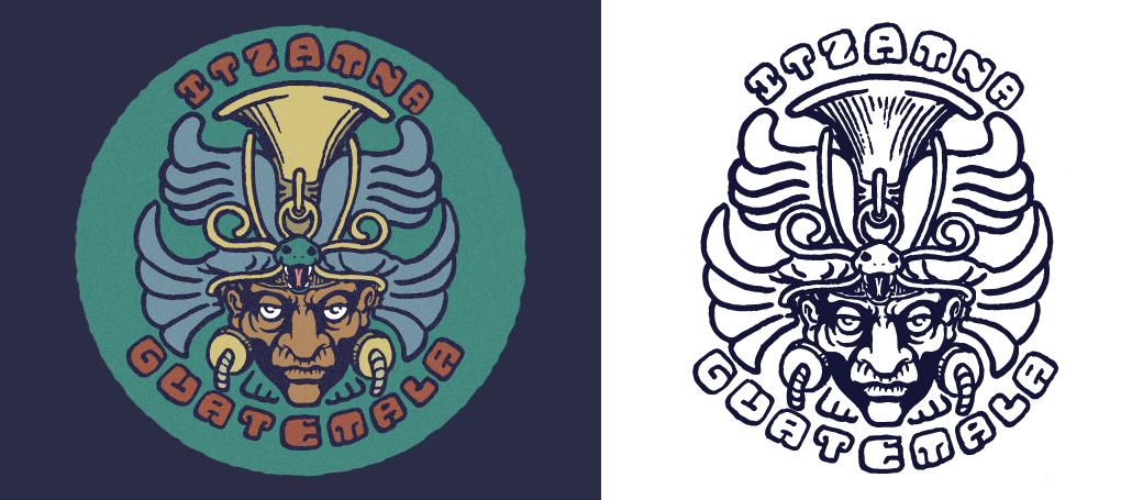
Itzamna was a Mayan god who was responsible for agriculture, among other things. He was represented as an old man, frequently cranky but happy to help his children in many different ways. For this mark, I looked to Pre-Columbian depictions of this venerated deity and Mayan hieroglyphs to create a modern interpretation of one of Intelligentsia’s oldest partnerships.
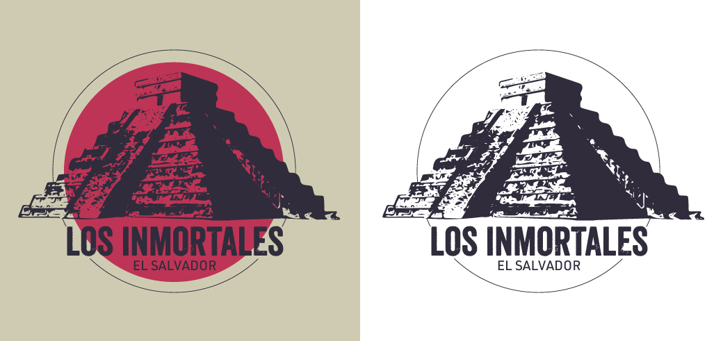
The original mark for this coffee was Hermes. Not only did it remind me too much of the FTD logo, it seemed a shame not to pay respect to the region’s history, particularly when there is a pyramid so close to the main farm, Malacara. To me, the ancient monuments of Mesoamerica stand as a testament to an enduring legacy. What better way to honor these “Inmortales”?
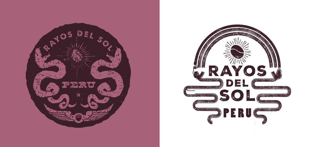
Rayos del Sol is a farm Intelligentsia works with in Peru. This mark was based off of a crest that one of the farmers liked. The version on the right was a quick and dirty logo, the version on the left was the final version.
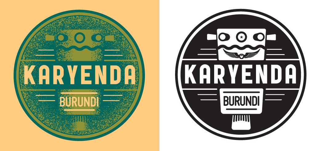
The karyenda is a drum reserved for sacred rituals in Burundi. This mark pays homage to the coffee’s namesake.
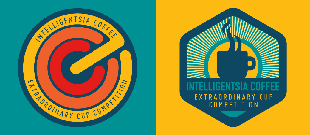
Two proposed marks for Intelligentsia’s Extraordinary Coffee Competition, a new competition held within the ECW conference.
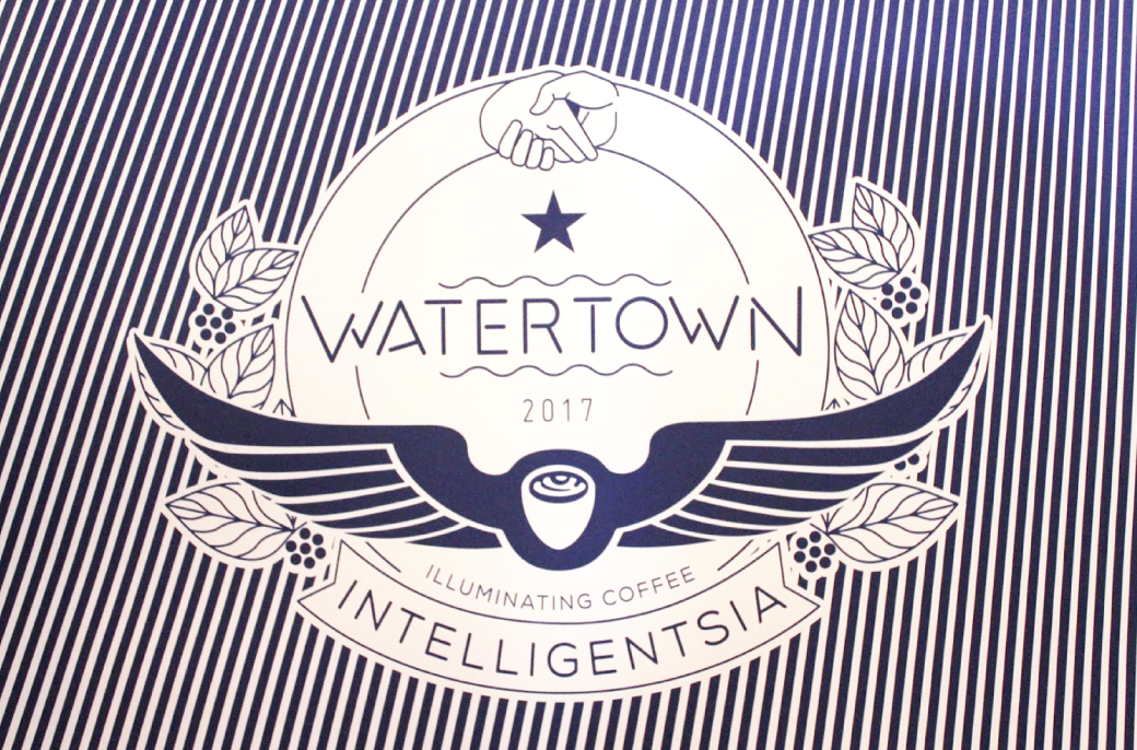
A seal designed for the Watertown coffee bar, here with the op-art lines. This specific graphic was used for the windows before opening, but the seal was applied across multiple platforms. It was initially inspired by Watertown’s city seal.
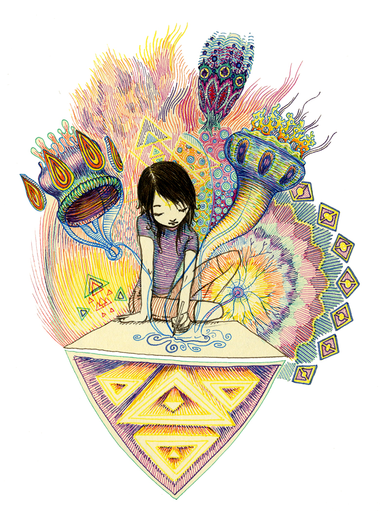
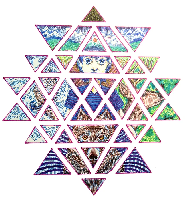
drawings in ink
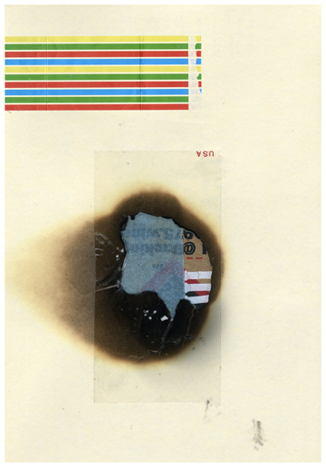
collages (hand and computer)
a painting or two
The following is a series of prints made in collaboration with Kilogram Tea.
Archival ink on paper (3.5'x6') $1200 2012
Archival ink on paper (3'x6') $1200 2012
Archival Ink on Oak Tag paper 2011 (12" x 16.5") SOLD
Archival Ink on Oak Tag paper 2011 (12" x 16.5") SOLD
Archival Ink on Oak Tag paper 2011 (12" x 16.5") SOLD
Archival ink on paper (3'x3') SOLD 2010
Archival ink on paper (3'x4.5') SOLD 2010
Archival ink on paper (2'x3') $1000 2010
Archival ink on paper (2'x3') $1000 2010
Archival ink on paper (2'x3') COMMISSION 2010
Archival ink on paper (11"x20") SOLD 2012
Image for Pretty Monsters album by Katherine Young, 2012.
Archival ink on paper (1.5'x1') SOLD 2007
Archival ink on paper (2'x3') SOLD 2007
Archival ink on paper (2'x3') SOLD 2006
Archival ink on paper (2'x3') SOLD 2006
Archival ink on paper (2'x3') SOLD 2006
Archival ink on paper (1'x1') SOLD 2009
Mixed media on board (1'x1') SOLD 2010
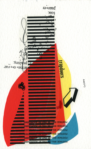
Letraset & Letratype on paper (4"x6") $300 2005
Collage on paper (4"x6") SOLD 2006
Collage on Paper (4"x6") $400 2006
Archival ink on found paper (3"x5") N/A 2006
Oil on board with handmade frame (1'x1.5') $1500 2005
Ink, letraset, polyurethane (1'x2") $1000 2005
Ink, letraset (2'x2') N/A 2005
Ink , letraset on paper (1.5'x2') $1000 2005
Commission for the Atlanta Chamber of Commerce
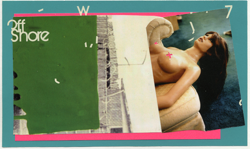
Digital collage (3'x3') 1999
Digital collage (2'x2') SOLD 1999
Digital collage (2'x2') SOLD 2001
Digital collage (2'x2') SOLD 1998
Limited Edition Collage (direct from sketchbook) Digital Print, 4 of 5
remain (1.5'x2') $500 (2011)
Limited Edition Digital Collage Print, 4 of 5 remain (1'x20") $500 (2011)
Limited Edition Digital Collage Print, 4 of 5 remain (18"x2') $500 (2011)
Limited Edition Collage (direct from sketchbook) Digital Print, 4 of 5
remain (1'x20") $500 (2011)
Limited Edition Digital Collage Print, 4 of 5 remain (15"x2') $500 (2011)
Limited Edition Collage (direct from sketchbook) Digital Print, 4 of 5
remain
(13"x2') $500 (2011)Limited Edition Collage Print, 4 of 5 remain (14"x20") $500 (2011)
Black & white film,
Ektachrome slide,
analog and digital
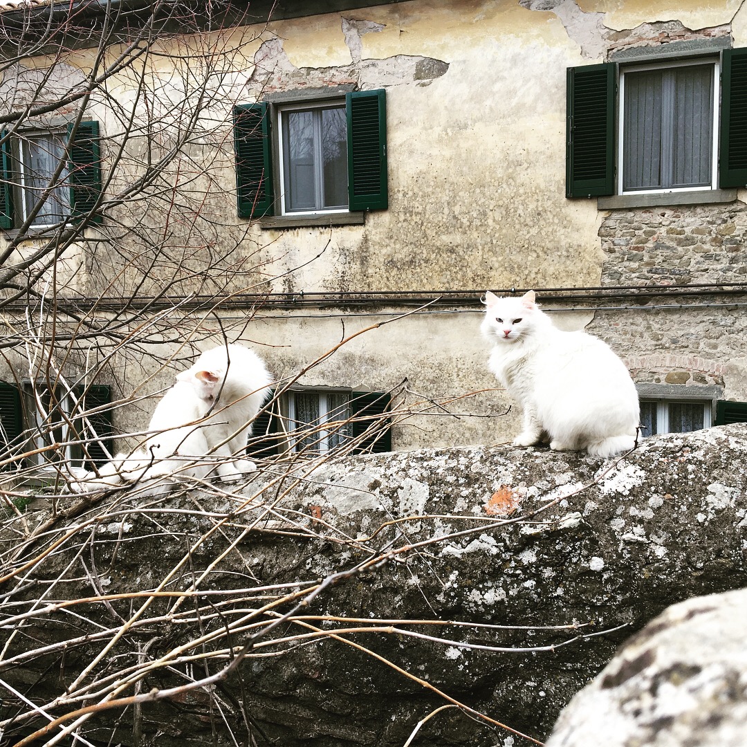
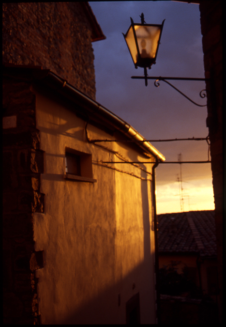
Cortona, Italy
2018
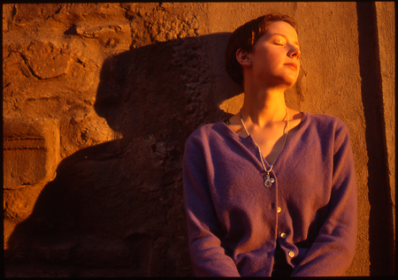
Cortona, Italy
2018
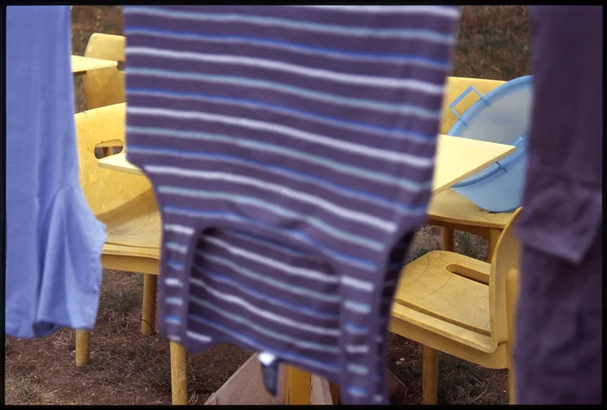
Cortona, Italy
2018
Cortona, Italy
2018
Vernazza, Italy
2018
Vernazza, Italy
2018
2016
Mendocino, California
Mendocino, California
Mendocino, California
Maker’s Mark Distillery
Loretto, Kentucky
Chicago, IL
Portland, OR
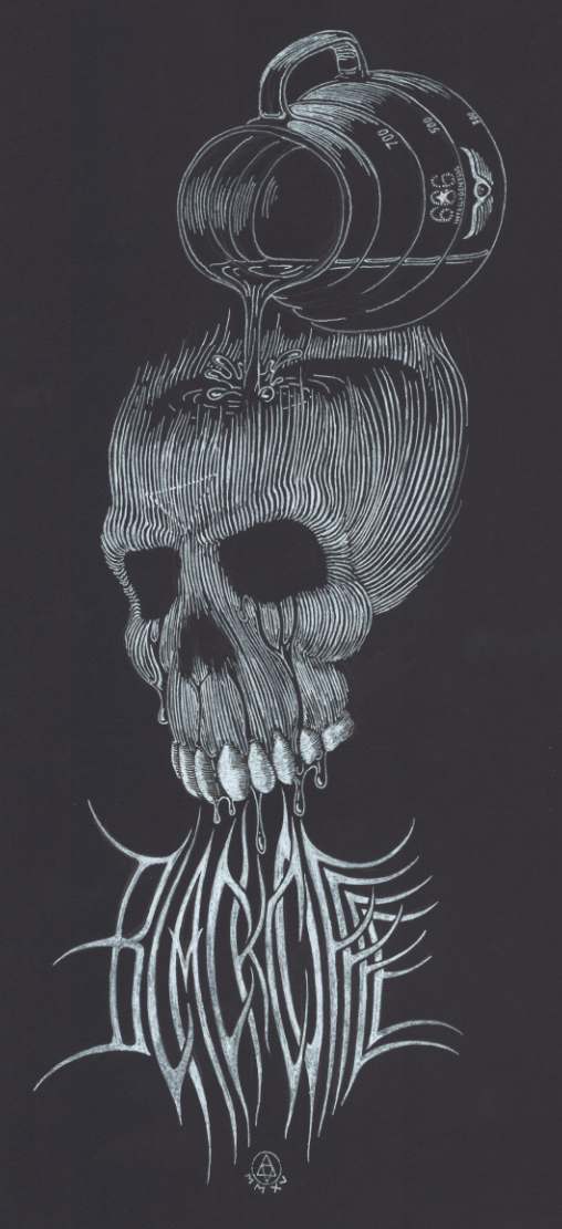
Black Coffee shirt design for Intelligentsia Coffee, 2015. Available here
Package design also by Rob Patterson, 2015
Package design also by Rob Patterson, 2015
package design also by Rob Patterson, 2015.
Finca Santuario package design also by Rob Patterson, 2015
The Finca Takesi Reserve collection exploded.
2014
2015
2015
2015
2015
2015
2015
2015
2015
Gif for Intelligentsia's Instagram.
Product photography for Solemn Oath Brewing and Intelligentsia collaboration. 2015
Cortona, Italy 1999 b&w
Cortona, Italy 1999 b&w
Cortona, Italy 1999 b&w
Cortona, Italy 1999 b&w
Cortona, Italy 1999 b&w
Cortona, Italy 1999 b&w
St Denis, France 1999 b&w
St Denis, France 1999 b&w
Copenhagen, Denmark 1996 b&w
Greenville, SC 1995 b&w
Cortona, Italy 1999 ektachrome slide
Cortona, Italy 1999 ektachrome slide
Cortona, Italy 1999 ektachrome slide
Cortona, Italy 1999 ektachrome slide
Cortona, Italy 1999 ektachrome slide
Cortona, Italy 1999 ektachrome slide
Cinque Terra, Italy 1999 ektachrome slide
Cortona, Italy 1999 ektachrome slide
Cortona, Italy 1999 ektachrome slide
Cortona, Italy 1999 ektachrome slide
Cortona, Italy 1999 ektachrome slide
Cortona, Italy 1999 ektachrome slide
Cortona, Italy 1999 ektachrome slide
Cortona, Italy 1999 ektachrome slide
Cortona, Italy 1999 ektachrome slide
Cortona, Italy 1999 ektachrome slide
Cortona, Italy 1999 ektachrome slide
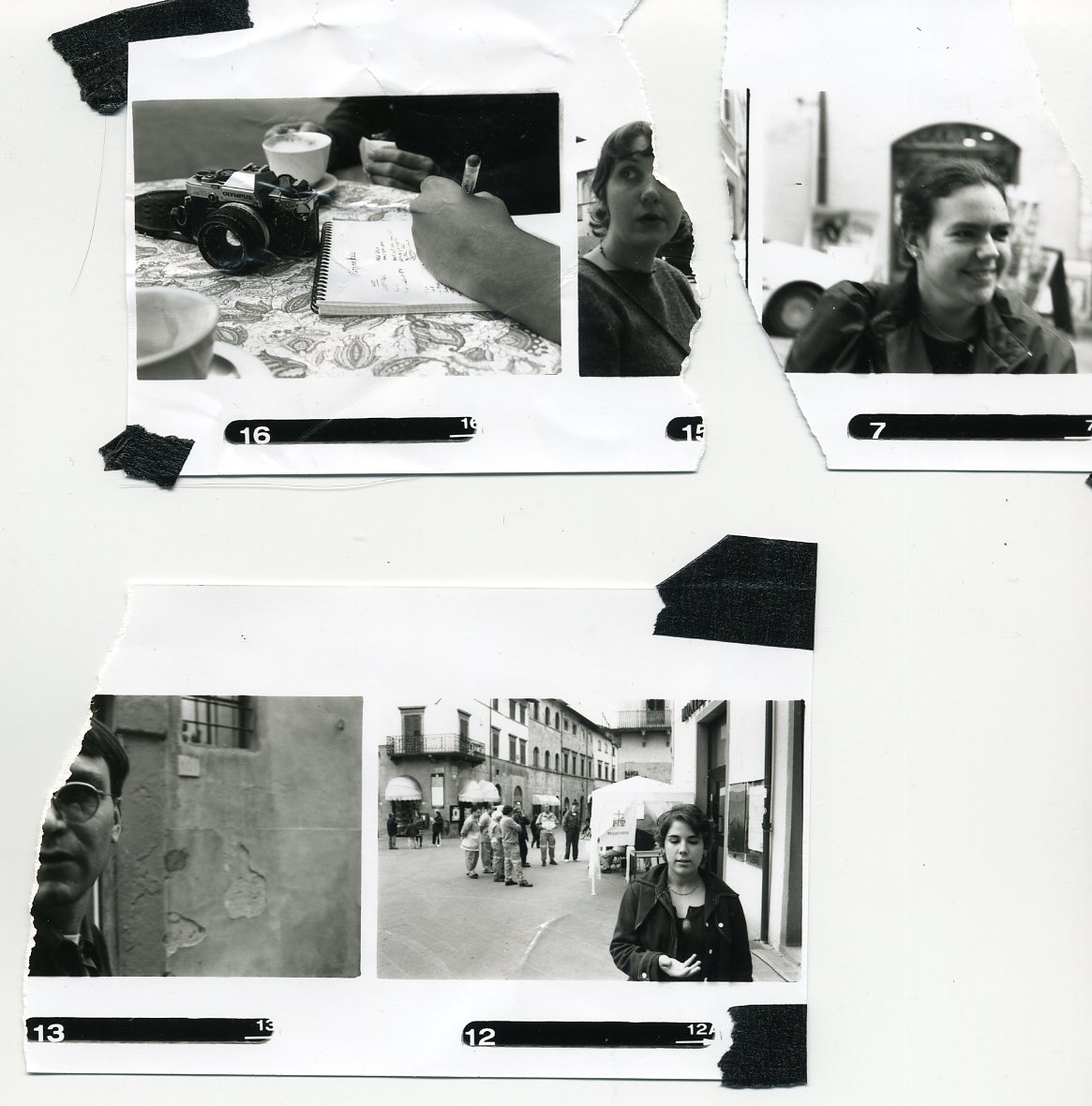
Cortona, Italy 1999 b&w contact sheet
Cortona, Italy 1999 b&w contact sheet
Nashville, TN 2008 digital
Rogers Park, Chicago, IL 2008 iPhone
Winter Session, Chicago, IL 2010 iPhone
Winter Session, Chicago, IL 2010 iPhone
Chicago, IL 2010 iPhone
Post Family, Chicago, IL 2011 iPhone
Post Family, Chicago, IL 2011 iPhone
Augusta, GA 2011 iPhone
Augusta, GA 2011 iPhone
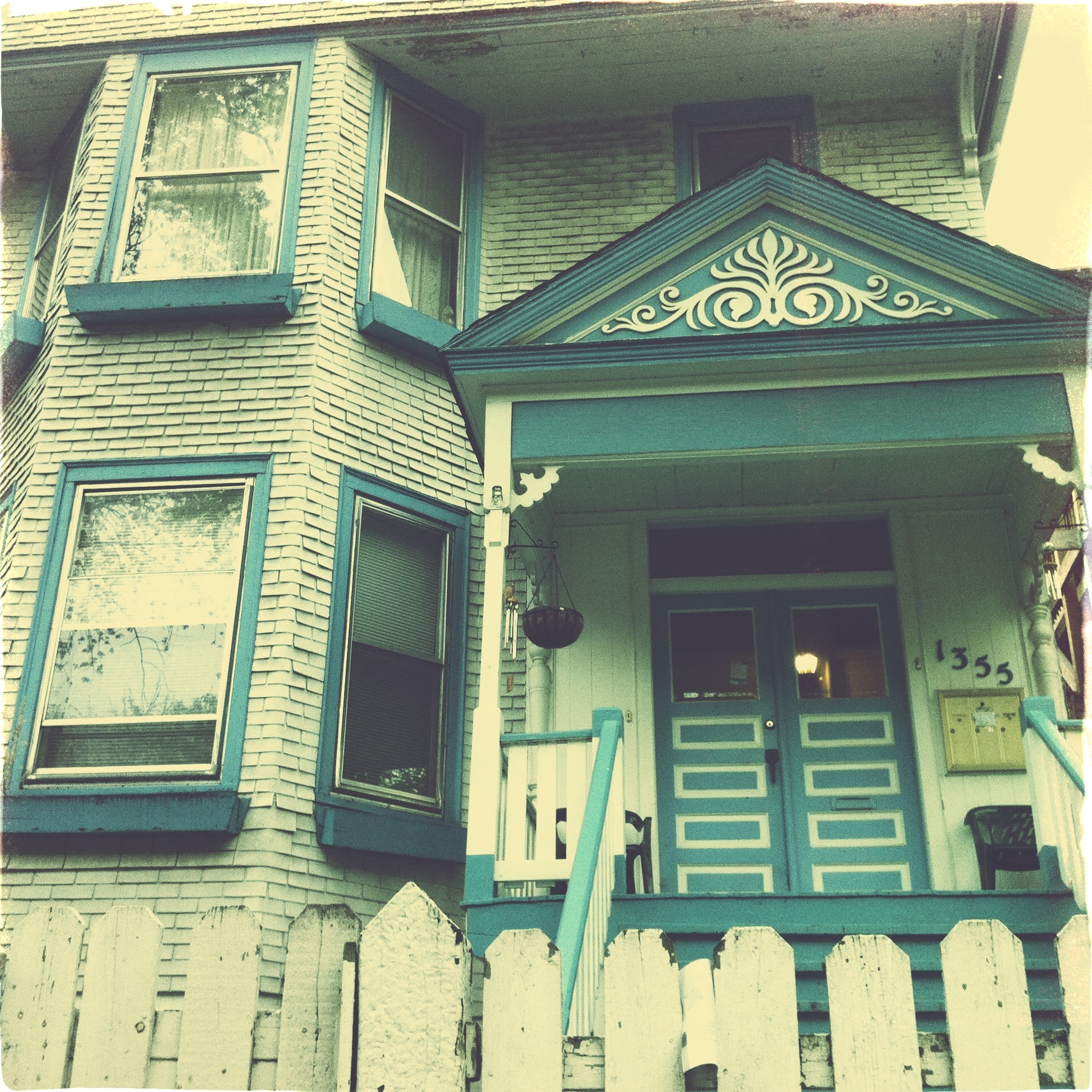
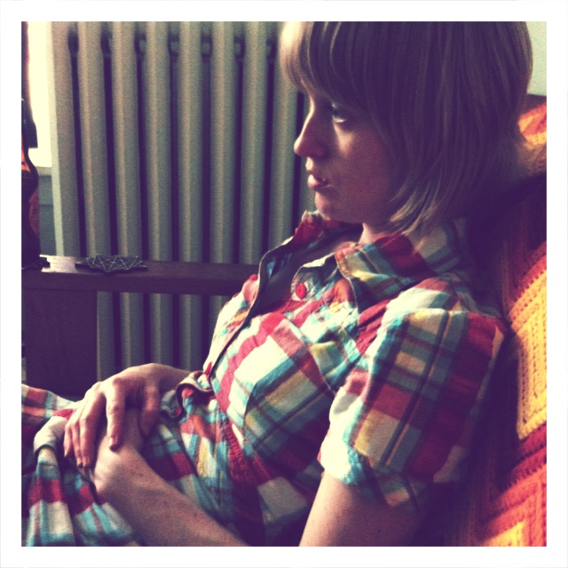
Andersonville, Chicago, IL 2011 iPhone
iPhone
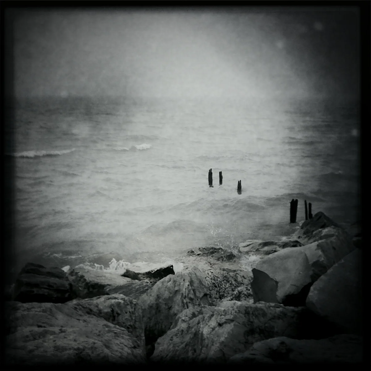
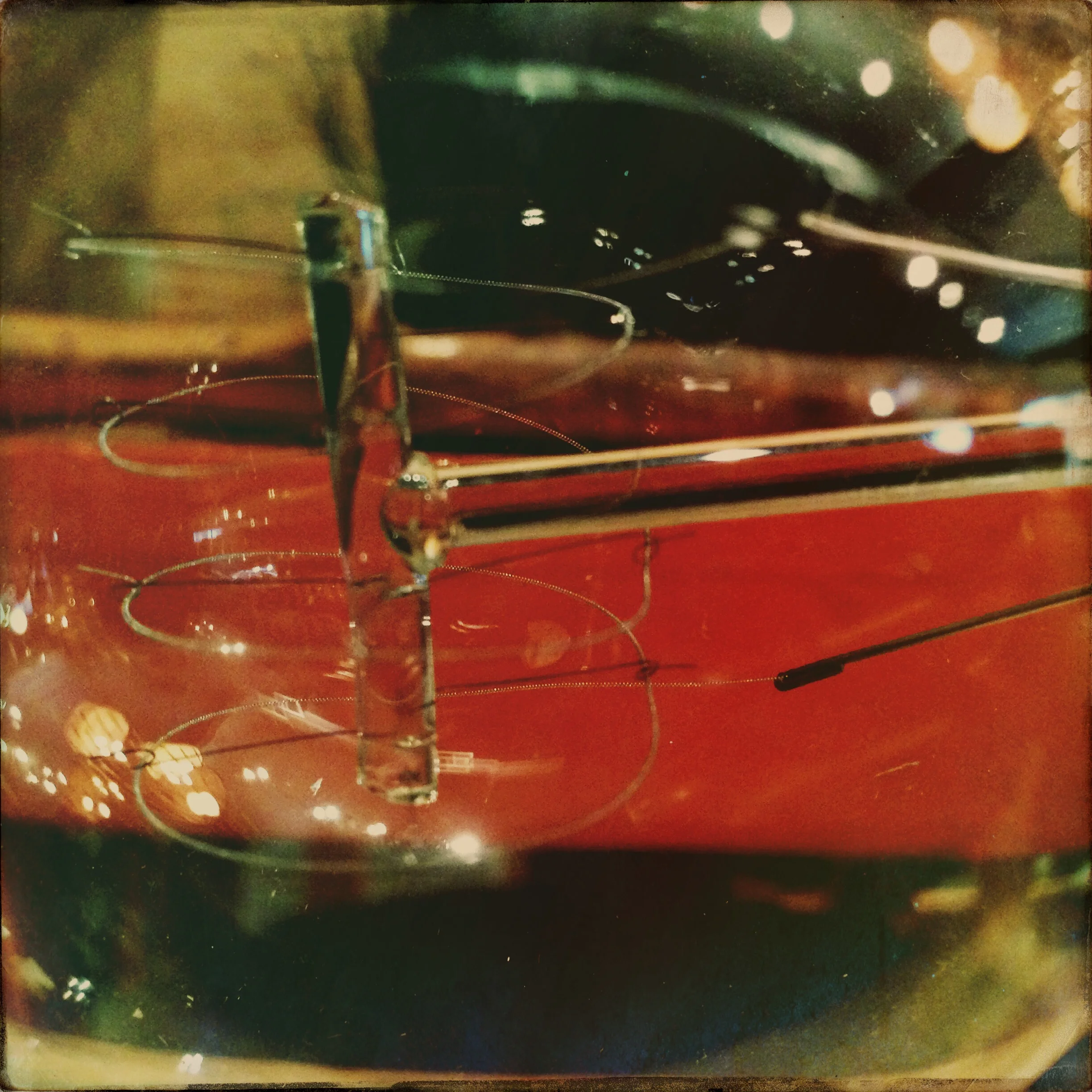
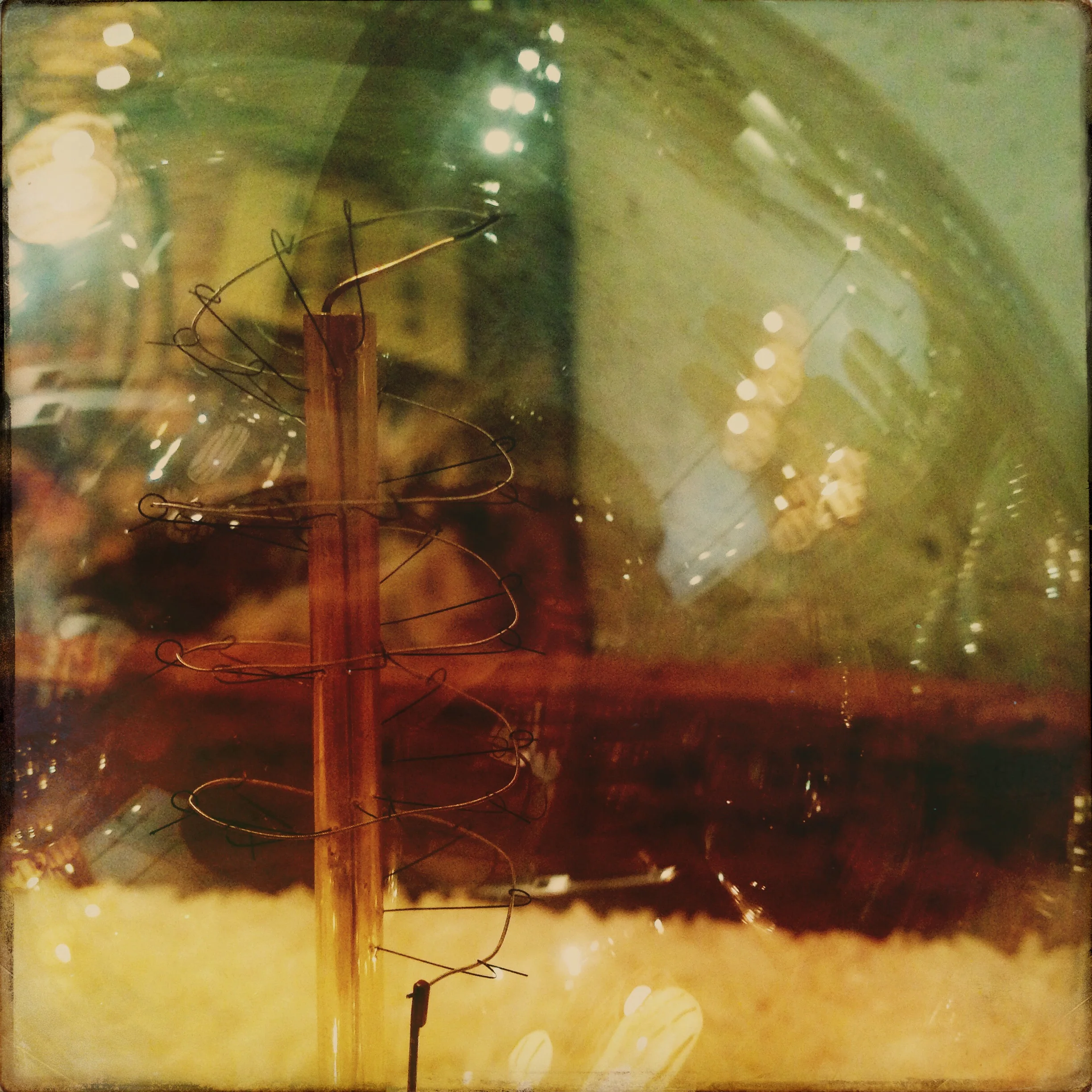
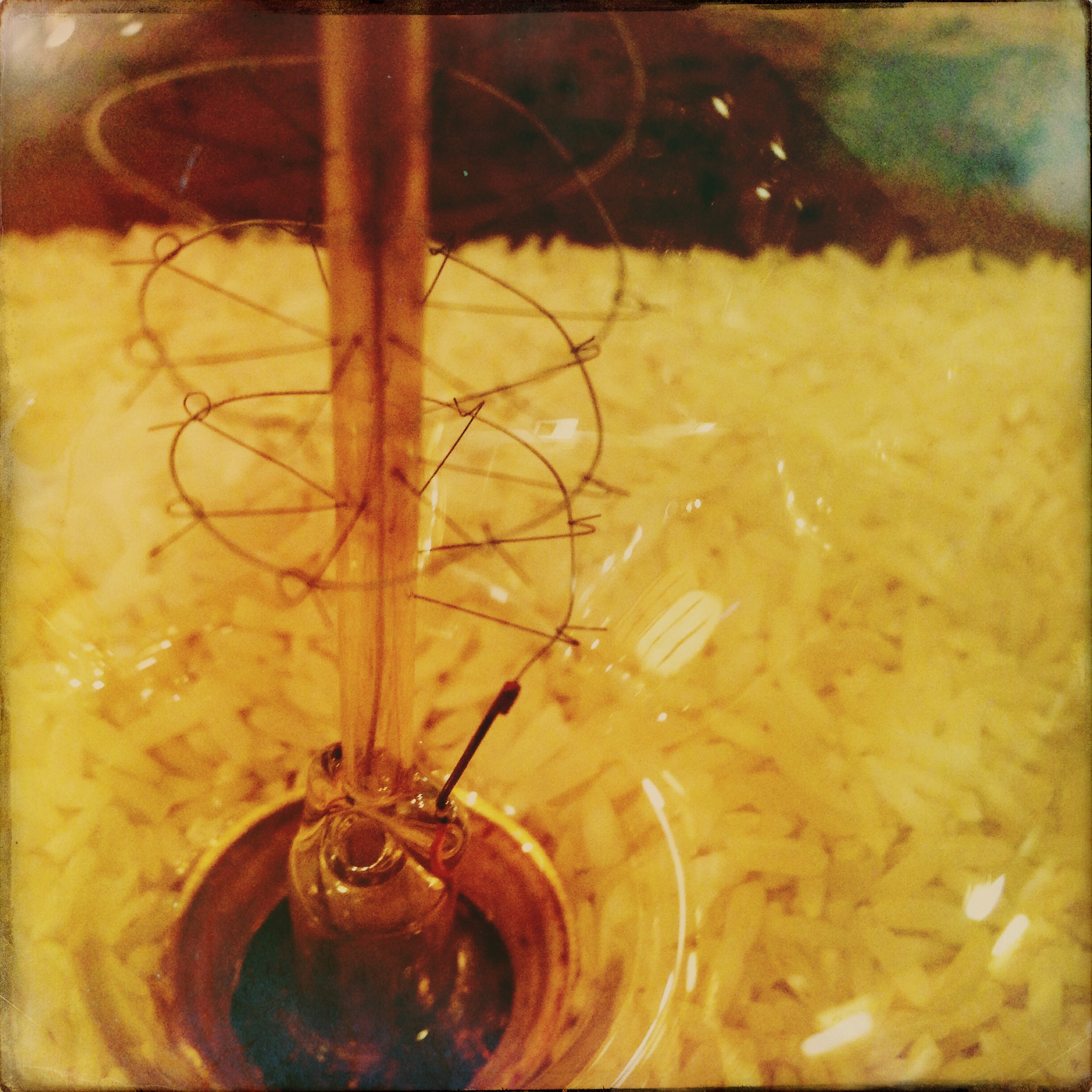
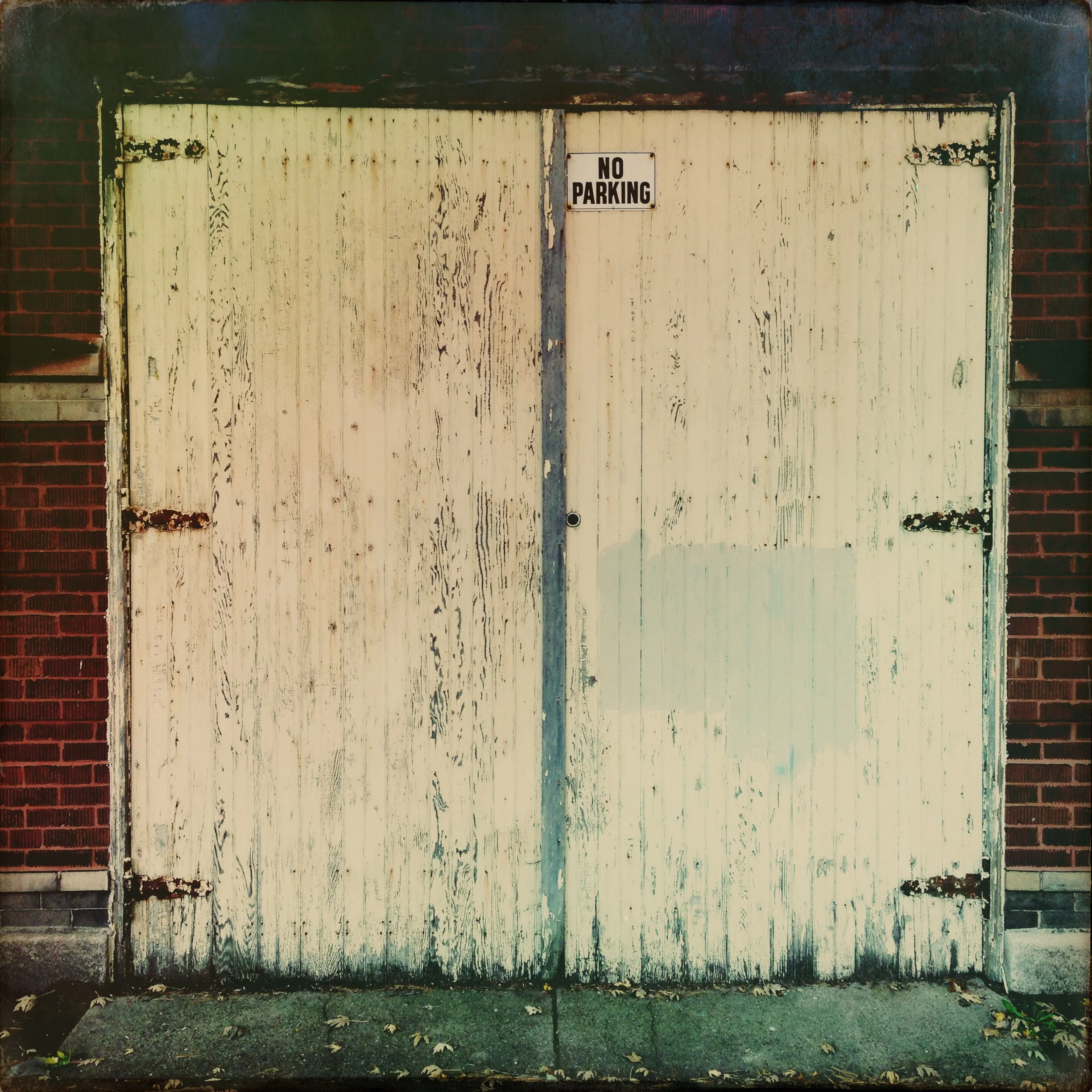
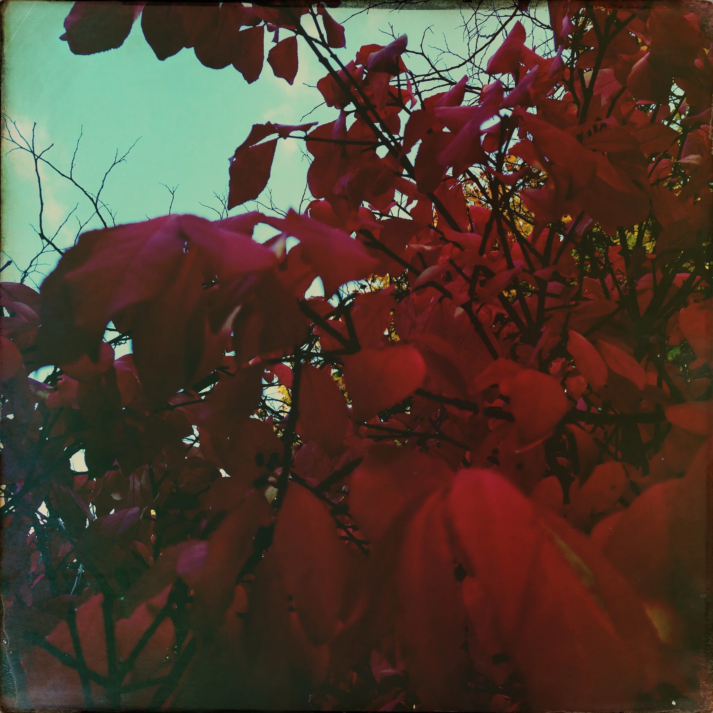
Chicago, IL 2011 iPhone
Chicago, IL 2011 iPhone
Chicago, IL 2011 iPhone
Chicago, IL 2011 iPhone
Chicago, IL 2011 iPhone
Chicago, IL 2011 iPhone
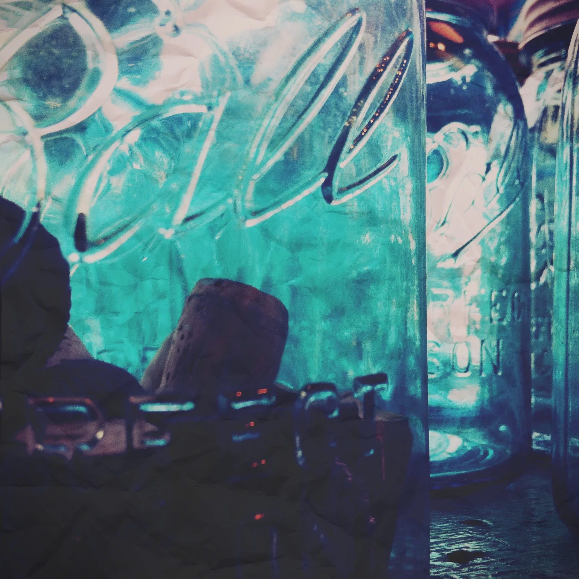
Chatsworth grounds, England 2012 iPhone
Chatsworth, England 2012 iPhone
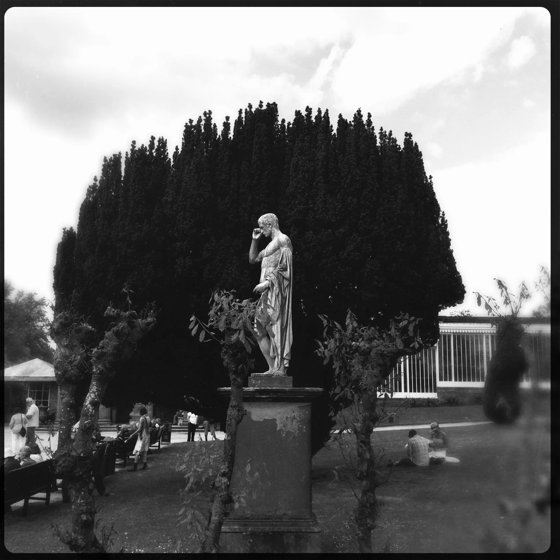
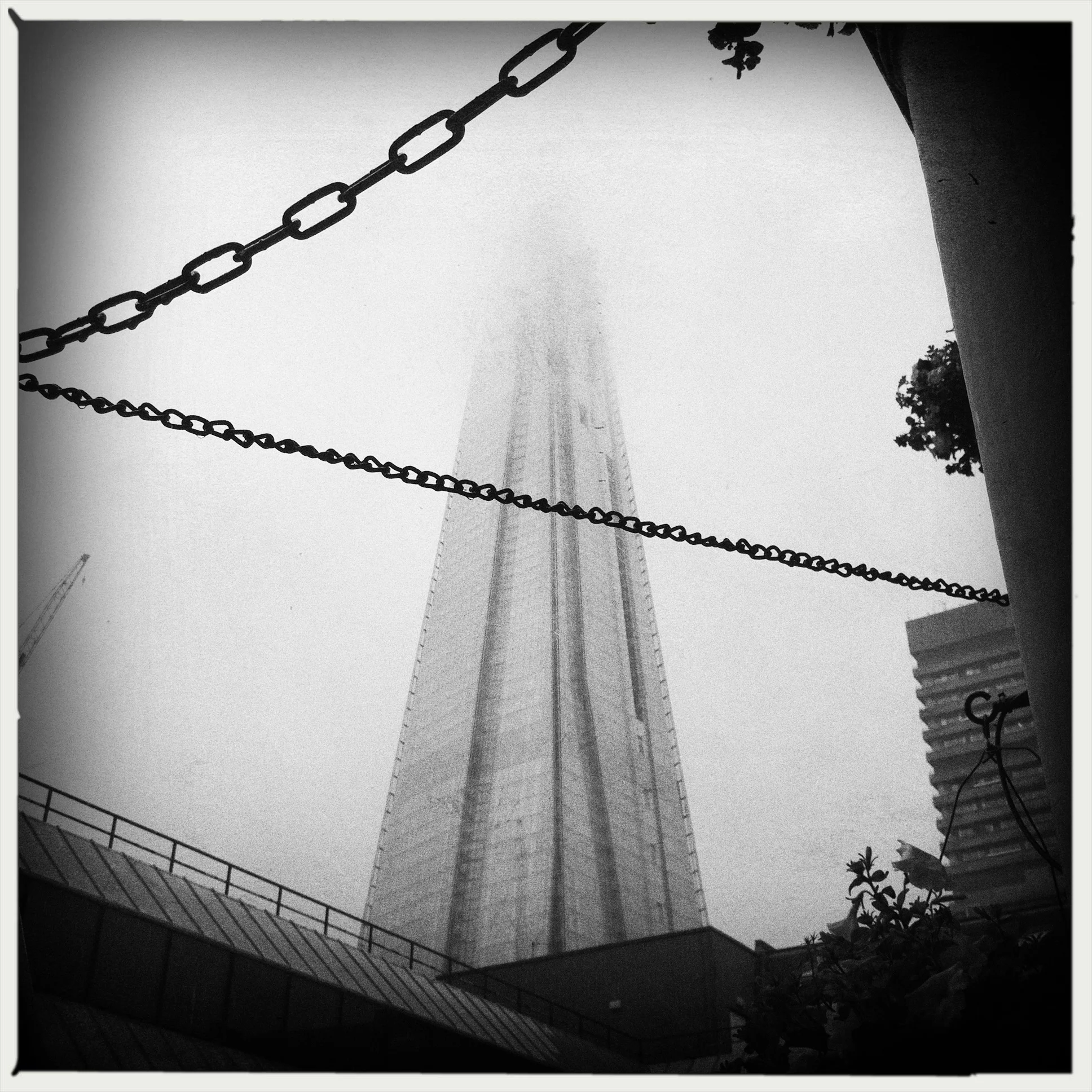
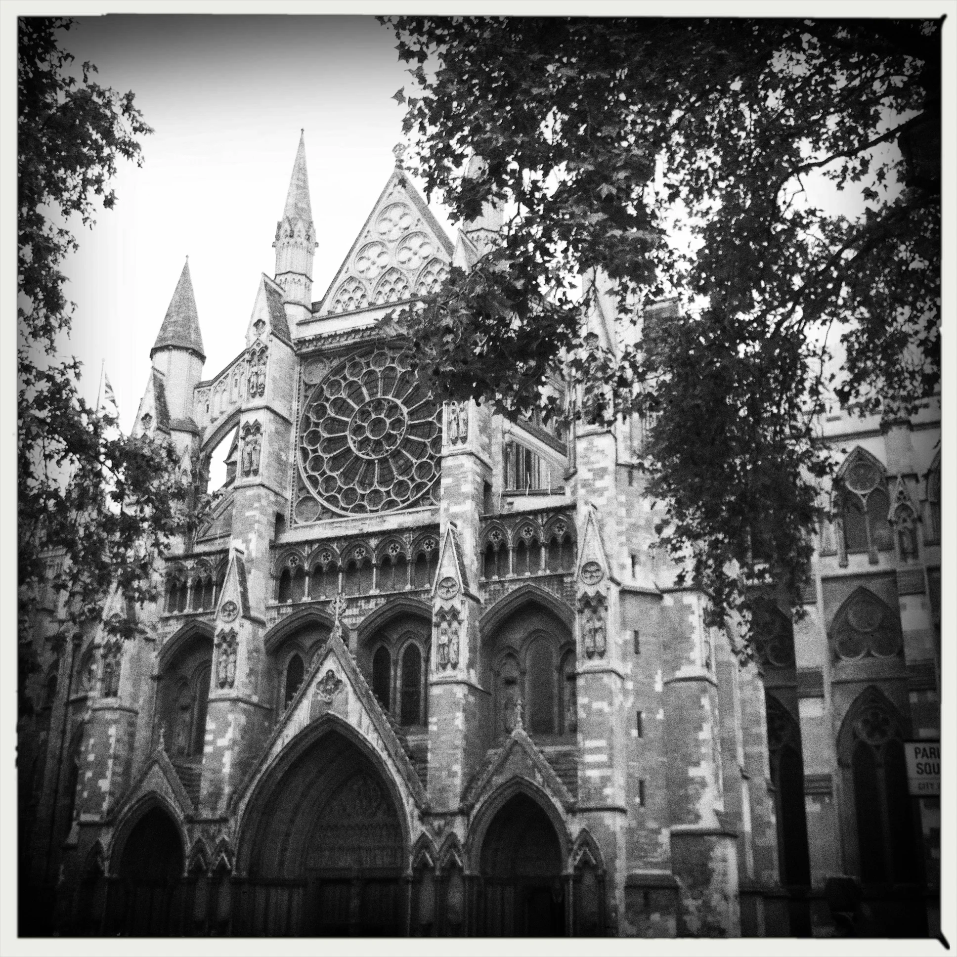
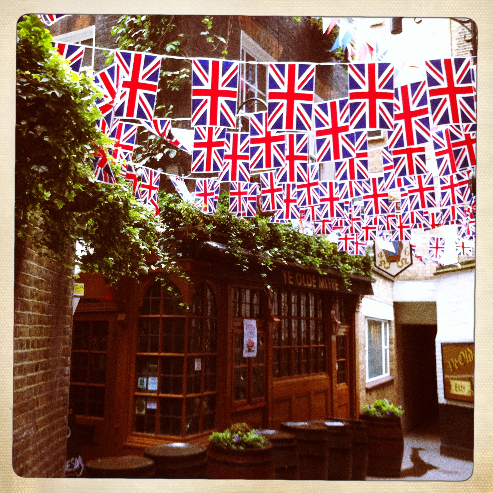
London, England 2012 iPhone
London, England 2012 iPhone
London, England 2012 iPhone
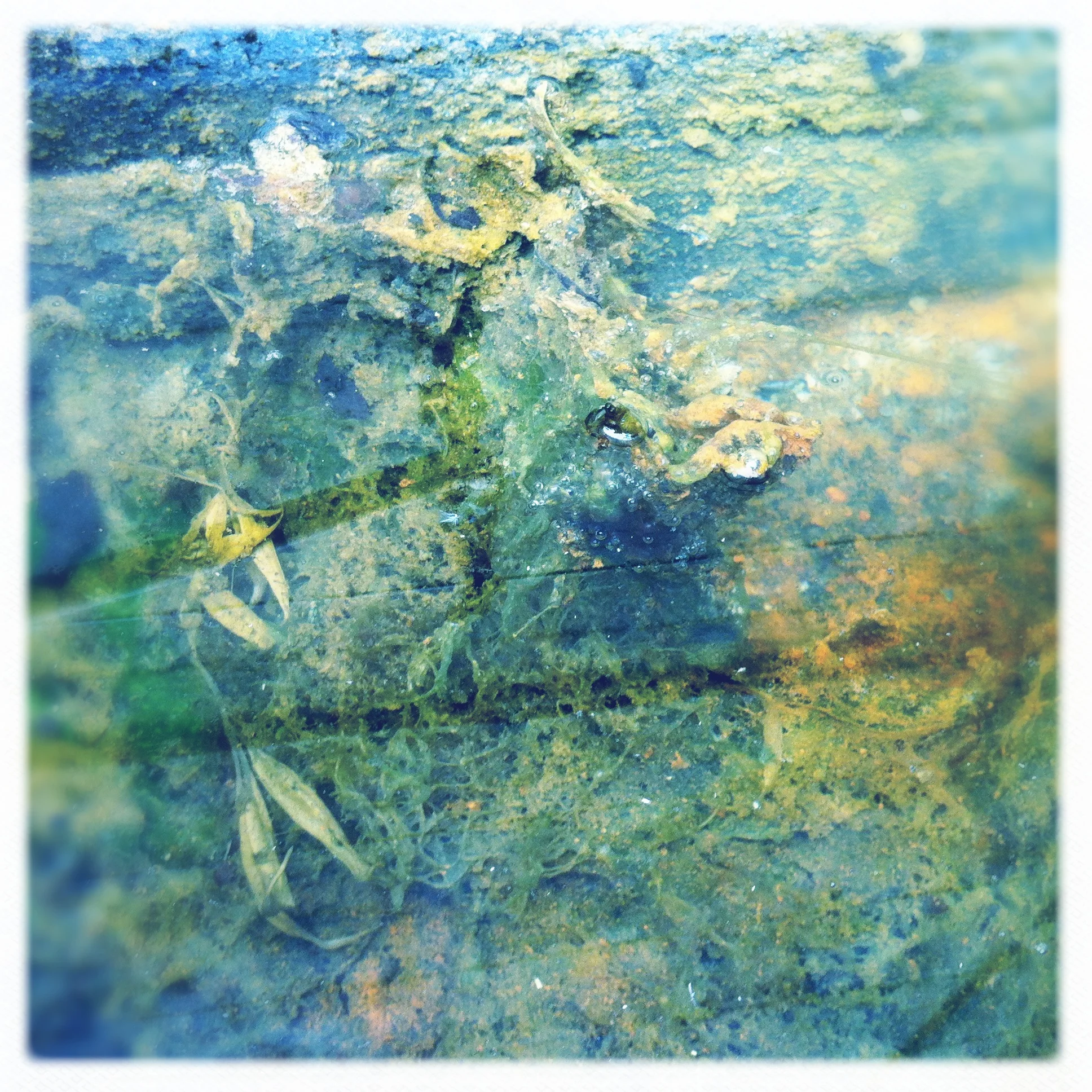
Chicago, IL 2013 iPhone
Chicago, IL 2013 iPhone
Chicago, IL 2013 iPhone
Chicago, IL 2013 iPhone
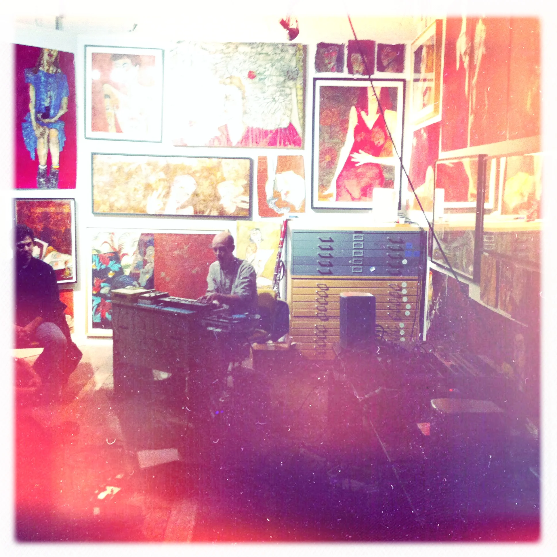
Opening for Oneohtrix Point Never
Jeffew at the Shift installation, Chicago Cultural Center
Metro, Chicago, October 13
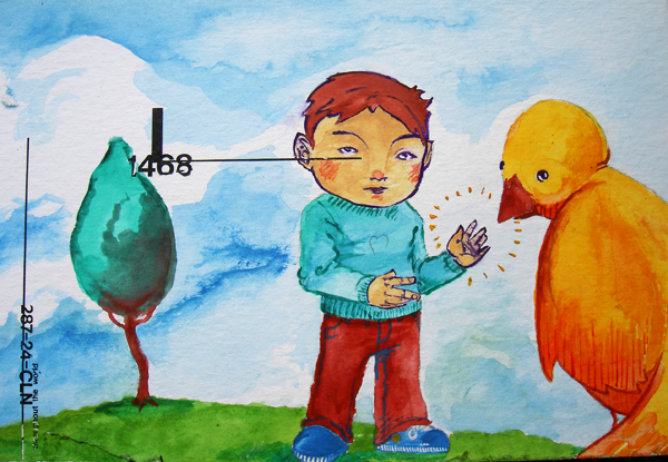
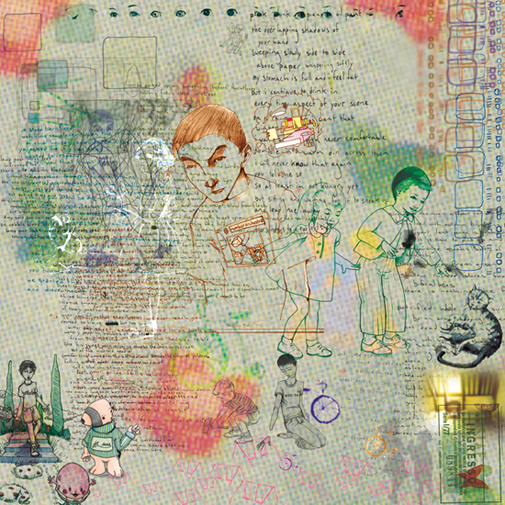
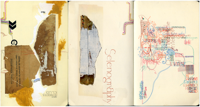
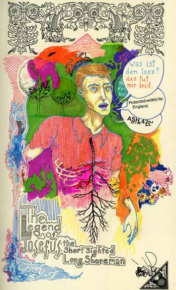
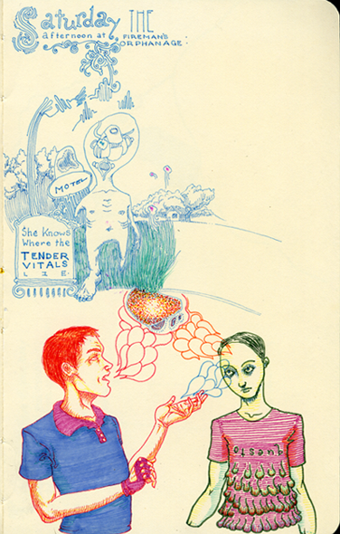
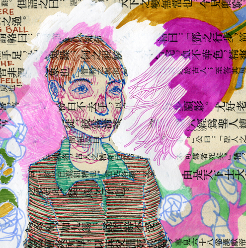
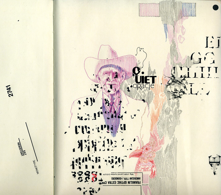
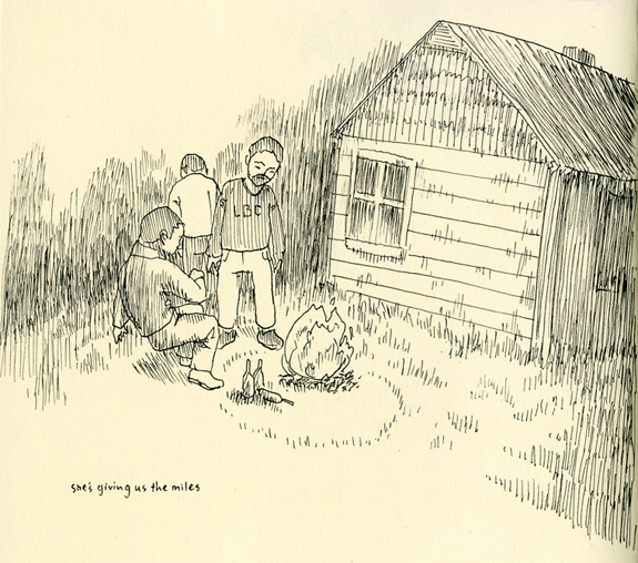
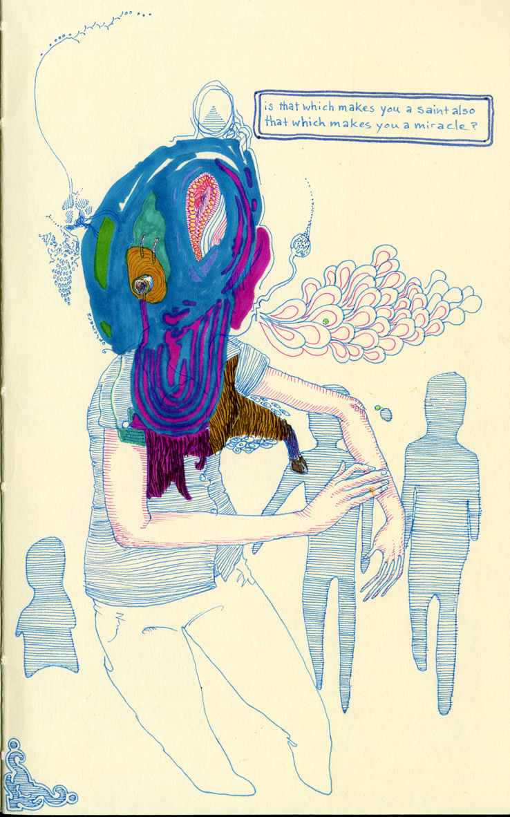
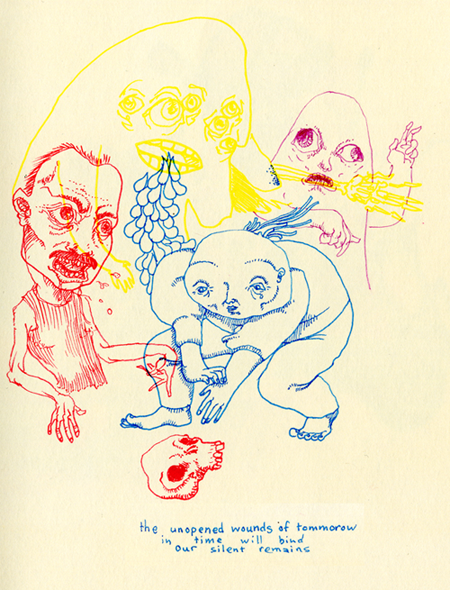
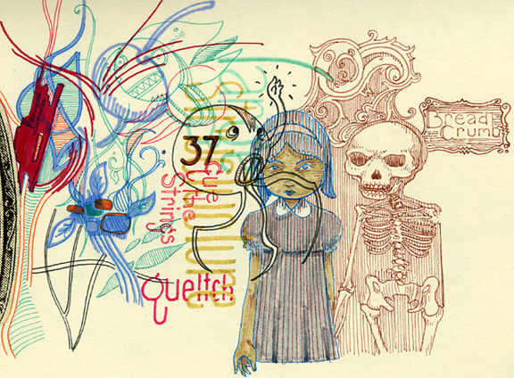
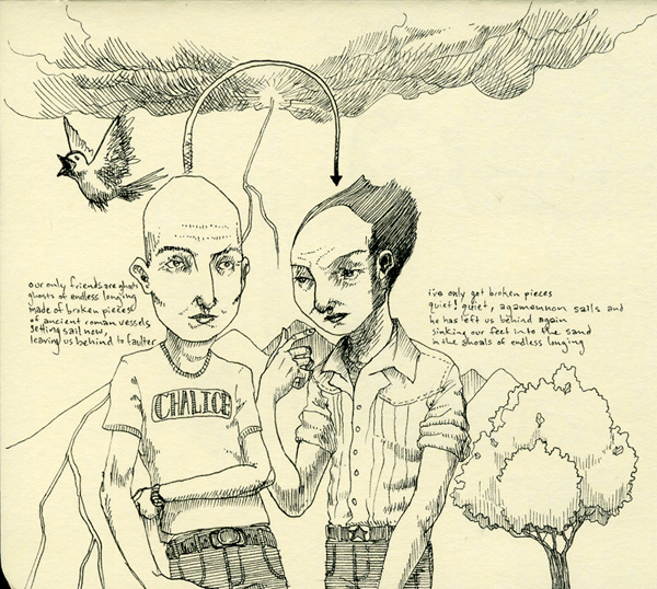
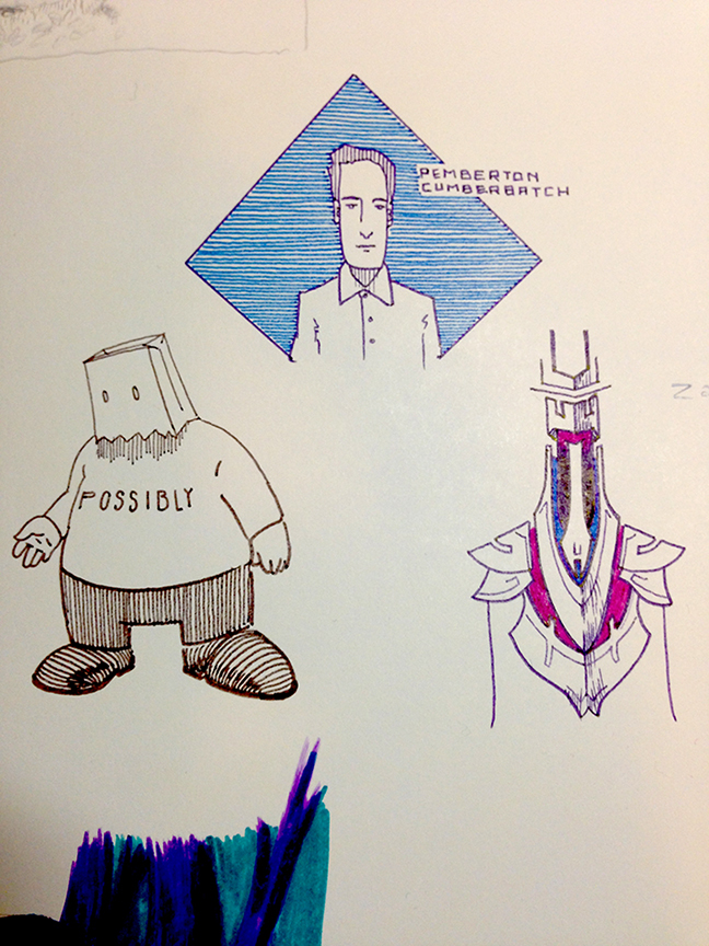
A selection from sketchbooks over the years
Initial sketch for a retail poster, 2014